Difference between revisions of "Exercise 09: Managing Data"
From AgileApps Support Wiki
Wikieditor (talk | contribs) |
Wikieditor (talk | contribs) |
||
| Line 1: | Line 1: | ||
== | ==Theory== | ||
===Data Display Options=== | |||
:* Views and Reports organize data to be displayed | |||
:* Views and Reports can be also displayed as Widgets on a Dashboard | |||
'''Views''' | |||
:* Find “records of interest” and present them on screen | |||
:* Present data of one Object in a list format | |||
:* Typically used to navigate to particular records | |||
:* Default Views and custom Views | |||
'''Reports''' | |||
:* Provide high-level perspective operations | |||
:* List records, make graphs, �calculate summaries (max, min, sum, avg) | |||
:* Add formula fields | |||
:* Example: (numberField=1) if checkbox_flag=true, �else (numberField=0) | |||
:* Can then total the number of checkboxes �and get sum or average | |||
:* Can also be used to drill down to �a particular record (like a View) | |||
:* Can display joined data of related Objects �using Database Views | |||
===Custom Views=== | |||
:* You can edit/configure default Views for an Object | |||
:* You can also add custom Views for an Object | |||
:* Specify: | |||
:** Fields to be displayed | |||
:** Field column order | |||
:** Optional filter(s) by �date or field value | |||
:* Provide a View name when saving | |||
:* Determine visibility | |||
===Report Features - Overview=== | |||
:* Organize Reports into report folders | |||
:* Group data by rows and columns | |||
:* Computation functions | |||
:* Color Coding | |||
:* Chart data in many graphic styles | |||
:* Email Reports to individuals or teams | |||
:* Display Reports as a widget on the Dashboard | |||
:* Export Reports to PDF or CSV file | |||
:* Excel Print ( .xlsx) | |||
:* HTML Print ( browser window, use “Save As” to store) | |||
:* Create ad hoc Computed Fields (in each record)�and Summary Computed Fields� (to summarize a column of data) | |||
:* Report Schedules:�run one or more Reports at a specific time | |||
:* Join & present data of multiple Objects via Database Views | |||
===Structures that can be Used in Reports=== | |||
:* Chart formats: | |||
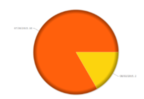
:** Pie<br>[[File:Pie.png|100px]]<br> | |||
:** Funnel<br>[[File:Funnel.png.png|100px]]<br> | |||
:** Line<br>[[File:Funnel.png.png|100px]]<br> | |||
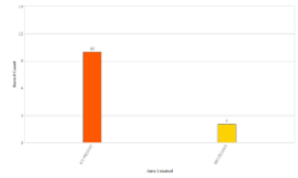
:** Bar Chart<br>[[File:Bar_Chart.png|100px]]<br> | |||
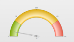
:** Meter Gauge<br>[[File:Meter_Guage.png|100px]]<br> | |||
:* Tabular Reports display data in rows and columns with color coding<br>[[File:Tabular_Reports.png|100px]]<br> | |||
:* Matrix Reports summarize data<br>[[File:Matrix_Report.png|100px]]<br> | |||
==Exercise== | |||
This exercise has four parts: | This exercise has four parts: | ||
:* In Part 1, [[Part 1: Create a custom View|you create a custom View that shows only Priority 2 orders.]] | :* In Part 1, [[Part 1: Create a custom View|you create a custom View that shows only Priority 2 orders.]] | ||
Revision as of 13:12, 14 December 2022
Theory
Data Display Options
- Views and Reports organize data to be displayed
- Views and Reports can be also displayed as Widgets on a Dashboard
Views
- Find “records of interest” and present them on screen
- Present data of one Object in a list format
- Typically used to navigate to particular records
- Default Views and custom Views
Reports
- Provide high-level perspective operations
- List records, make graphs, �calculate summaries (max, min, sum, avg)
- Add formula fields
- Example: (numberField=1) if checkbox_flag=true, �else (numberField=0)
- Can then total the number of checkboxes �and get sum or average
- Can also be used to drill down to �a particular record (like a View)
- Can display joined data of related Objects �using Database Views
Custom Views
- You can edit/configure default Views for an Object
- You can also add custom Views for an Object
- Specify:
- Fields to be displayed
- Field column order
- Optional filter(s) by �date or field value
- Provide a View name when saving
- Determine visibility
Report Features - Overview
- Organize Reports into report folders
- Group data by rows and columns
- Computation functions
- Color Coding
- Chart data in many graphic styles
- Email Reports to individuals or teams
- Display Reports as a widget on the Dashboard
- Export Reports to PDF or CSV file
- Excel Print ( .xlsx)
- HTML Print ( browser window, use “Save As” to store)
- Create ad hoc Computed Fields (in each record)�and Summary Computed Fields� (to summarize a column of data)
- Report Schedules:�run one or more Reports at a specific time
- Join & present data of multiple Objects via Database Views
Structures that can be Used in Reports
Exercise
This exercise has four parts:
- In Part 1, you create a custom View that shows only Priority 2 orders.
- In Part 2, you generate a Report that includes a pie chart.
- In part 3, you create a Dashboard.
- In Part 4, you export data from an Object to an Excel spreadsheet.


