Charts
From AgileApps Support Wiki
Revision as of 01:53, 19 February 2011 by imported>Aeric (Text replace - '#Click '''Save'''' to '#Click '''[Save]'''')
Charting options provide the ability to create graphical representations of your data in Reports.
Add a Chart to a Report
- In a new or existing Report, click the [Group] tab
- In the Row Group section, select one or two fields to define grouping
- Charts can contain information grouped by one or two levels
- Column grouping is not used in Charts
- Click the Chart tab and select the type, size and location for the chart you want to display
- Learn more: Customizing Charts
- Enter Title, Size and Legend information
- Click the [Preview] button to check that the chart displays as intended
- Click [Save]
Customizing Charts
The following features are available in charts:
- Choose the chart type: Pie, Doughnut, Funnel, Line, Area, Bar Chart, Meter Gauge
- Choose the data set to include in the chart (X-Axis and Y-Axis)
- Choose the chart size (height and width), title, legend, orientation, location, etc., as appropriate for the chart type
Chart Formats
Available chart formats for Reports:
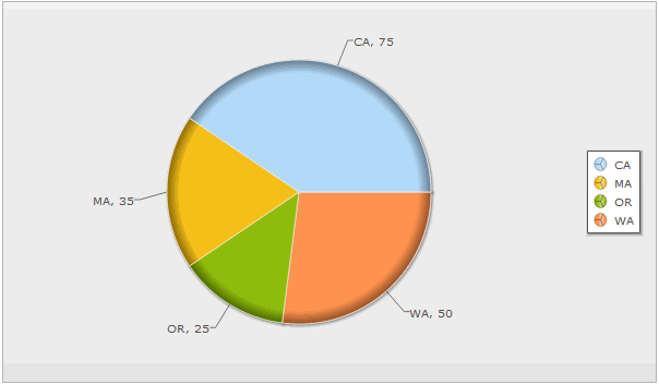
Pie Chart
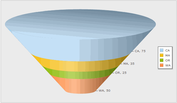
Funnel Chart
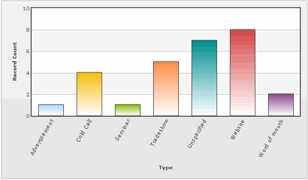
Vertical Bar Chart
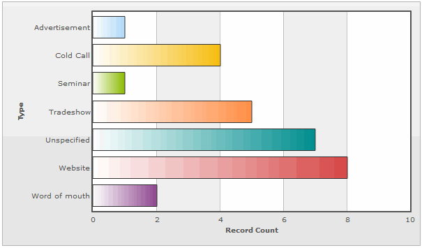
Horizontal Bar Chart
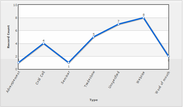
Line Graph
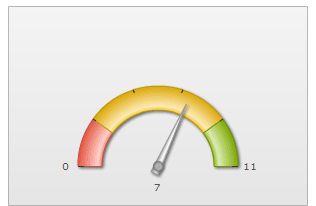
Meter Gauge
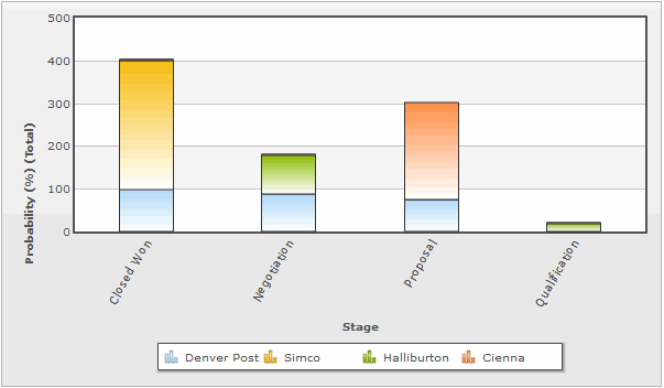
Vertical Stacked Bar Chart
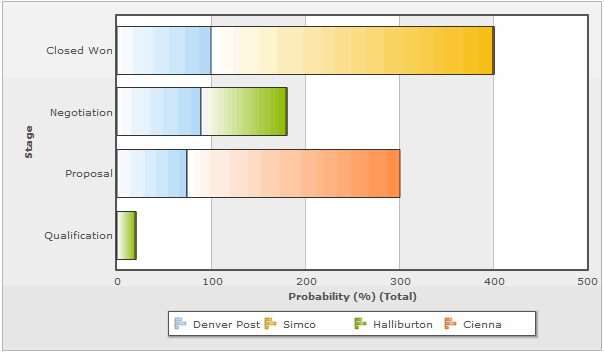
Horizontal Stacked Bar Chart
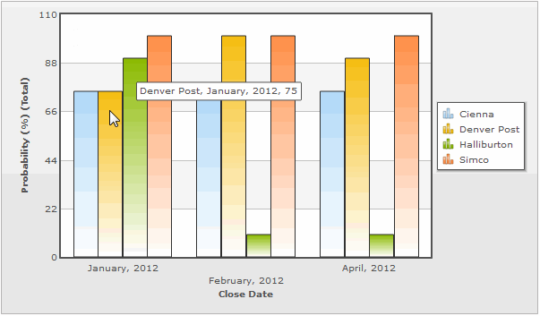
Vertical Grouped Bar Chart
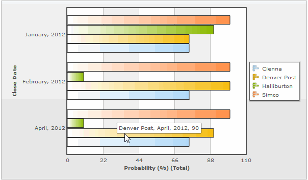
Horizontal Grouped Bar Chart


X-Axis and Y-Axis in Charts
- The X-Axis displays values horizontally (left-right)
X-Axis options in charts are defined via the Group tab
- The Y-Axis displays values vertically (up-down)
Y-Axis options in charts are defined via the Compute tab
X-Axis
- Selecting X-Axis Options
- From the Fields tab, select fields to display in the report
- From the Group tab, use the Row Group section to create X-Axis options
Y-Axis
- Selecting Y-Axis Options
- From the Compute tab, click the checkbox
 icon to select available Y-Axis field(s)
- Fields that have a Numeric Return Type (i.e., Number (integer or decimal), Percent or Currency) are displayed in the Compute grid, and become available as Y-Axis options
- The options for these fields are Total, Average, Minimum, and Maximum
Advanced Options for Charts
The available Advanced Options choices differ based on the chart type selected:
- Title: Chart Title
- Size: The chart size: Small, Medium, Large or Custom
- If Custom is selected, complete the following information:
- Height: Height of the chart, in pixels
- Width: Width of the chart, in pixels
- Chart Location: Above or Below the data table
- Value Labels: Show or hide the labels
- X-Axis Label: Show or hide the label
- Y-Axis Label: Show or hide the label
- Y Axis Number Format: Shown for vertical bar, line, and area charts
- X Axis Number Format: Shown for horizontal bar charts
- Y-Axis Ticks: The number of ticks displayed
- X Axis Tick Angle
- Y-Axis Maximum Range
- Bar Width(px)
- Bar Padding(px)
- Bar Margin(px)
- Markers: Show or hide the markers
- Shadows: Show or hide shadows
- Legend Position
- Legend Row: The number of rows in the legend
- Legend Columns: The number of columns in the legend
- Trend Line: Show or hide the trend line
- Gauge Start Value
- Gauge End Value
- Chart Border: Show or hide the chart border
- Chart Labels: Show Values, Show Percentages, None
- Chart Label Position