Charts
Charting options provide the ability to create graphical representations of your data in Reports.
Add a Chart to a Report
- In a new or existing Report, click the [Group] tab
- In the Row Group section, select one or two fields to define grouping
- Charts can contain information grouped by one or two levels
- Column grouping is not used in Charts
- Click the Chart tab and select the type, size and location for the chart you want to display
- Learn more: Customizing Charts
- Enter Title, Size and Legend information
- Click the [Preview] button to check that the chart displays as intended
- Click [Save]
Customizing Charts
The following features are available in charts:
- Choose the chart type: Pie, Funnel, Line, Area, Bar Chart, Meter Gauge
- Choose the data set to include in the chart (X-Axis and Y-Axis)
- Choose the chart size (height and width), title, legend, orientation, location, etc., as appropriate for the chart type
Chart Formats
Available chart formats for Reports:
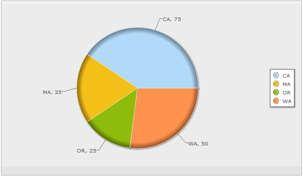
Pie Chart
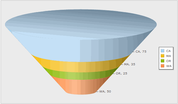
Funnel Chart
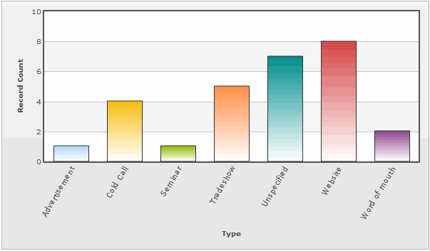
Vertical Bar Chart
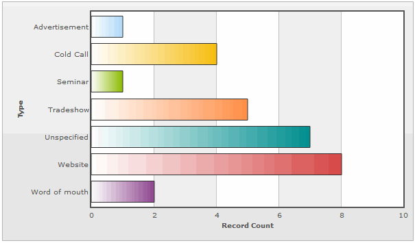
Horizontal Bar Chart
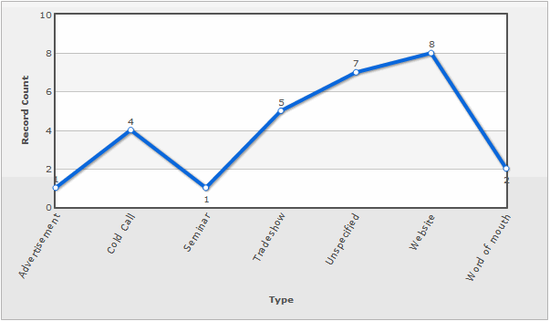
Line Graph
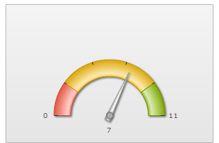
Meter Gauge
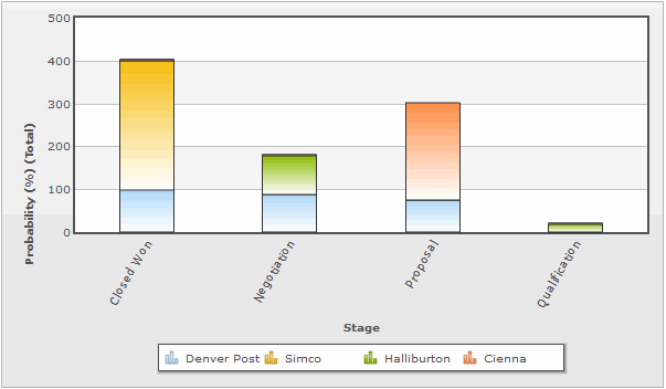
Vertical Stacked Bar Chart
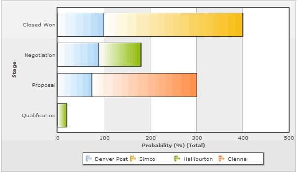
Horizontal Stacked Bar Chart
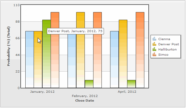
Vertical Grouped Bar Chart
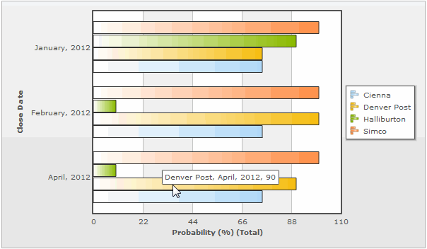
Horizontal Grouped Bar Chart


X-Axis and Y-Axis in Charts
X-Axis
- The X-Axis displays values horizontally (left-right).
- X-Axis options in charts are defined via the Group tab
To select X-Axis Options:
- From the Fields tab, select fields to display in the report
- From the Group tab, use the Row Group section to create X-Axis options
Y-Axis
- The Y-Axis displays values vertically (up-down)
- Y-Axis options in charts are defined via the Compute tab
To select Y-Axis Options:
- From the Compute tab, click the checkbox
 icon to select available Y-Axis field(s)
- Fields that have a Numeric Return Type (i.e., Number (integer or decimal), Percent or Currency) are displayed in the Compute grid, and become available as Y-Axis options
- The options for these fields are Total, Average, Minimum, and Maximum
Advanced Options for Charts
The choices in the Advanced Options section depends on the type of chart.
Common Options
These options are available in every chart:
- Title: Chart Title
- Size: The chart size: Small, Medium, Large or Custom
- If Custom is selected:
- Height: Height of the chart, in pixels
- Width: Width of the chart, in pixels
- Chart Location: Above or Below the data table
Advanced Options for Pie Charts and Funnel Charts
- Color Palette: Comma separated list of one or more hexadecimal color values, used one after the other. For example: #ff0000,#0a68dd,...
Learn more: HTML Colors
- Color Palette: Comma separated list of one or more hexadecimal color values, used one after the other. For example: #ff0000,#0a68dd,...
- Legend Position: Right, Bottom, Hide
Advanced Options for Bar Charts
- Bar Color: Different color, Same color
- Determines whether each bar in the chart displays with the same or a different color
- Color Palette:
- Comma separated list of one or more hexadecimal color values, used one after the other for bar chart colors. For example: #ff0000,#0a68dd,...
Learn more: HTML Colors
- Value Labels: Show or hide the labels
- X-Axis Label:
- Auto - Let the system decide the best way to show the labels.
- Wrapped - Keep labels short, wrapping text as needed
- 90 degree - Write the labels going upwards, instead of horizontally
- Slanted - Angle the labels for readability
- Staggered - Offset the labels, so they can be slightly longer without overlapping
- Data Value:
- Normal - In line with the data (best for a horizontal bar chart)
- 90 degree - at 90 degrees to the data (best for vertical bar or line chart)
- Data Value:
- Data Value Position: Inside or outside the data column.
Advanced Options for Line Charts
- Color Palette:
- Comma separated list of one or more hexadecimal color values, used one after the other for bar chart colors. For example: #ff0000,#0a68dd,...
Learn more: HTML Colors
- Value Labels: Show or hide the labels
- X-Axis Label:
- Auto - Let the system decide the best way to show the labels.
- Wrapped - Keep labels short, wrapping text as needed
- 90 degree - Write the labels going upwards, instead of horizontally
- Slanted - Angle the labels for readability
- Staggered - Offset the labels, so they can be slightly longer without overlapping
- Data Value:
- Normal - In line with the data (best for a horizontal bar chart)
- 90 degree - at 90 degrees to the data (best for vertical bar or line chart)
- Data Value:
MultiLine Charts
- When a chart specifies a grouping on the X-axis, multiple variables can be selected on the Y-axis. Each selected variable produces a line in the chart, connecting the values for that variable for each group.
- Note: Multiline charts are supported only for single level Row Grouping.
- For example, this chart is grouped by Last Name on the X-axis, showing values for units, price, and sales on the Y-axis:


Tip:
When a multiline chart displays values with different formats, the format of the first value in the list is used for the Y-axis and for each point on the chart. In such situations, it is generally best to specify the value with the simplest formatting.For example the values price and units are in Currency and Number formats, respectively. If price is specified first, then the unit-values displayed in the chart is formatted as though it were a currency, which could be confusing. Instead, specify units first. The price-values will then display as numbers, which is more readable.
Advanced Meter Gauge Options
- Value Labels: Show or Hide
- Gauge End Value