Smart Components for AgileApps
Introduction
The runtime UI components in AgileApps platform are exported as HTML element tags (custom elements) to customize the platform user interface. All the custom elements can make REST API calls internally and hence are knows as Smart Components.
You do not need to invoke API calls to render data in the Smart Components. The Smart Components use internal API calls to perform CRUD operations on records. Inputs to the APIs are usually passed as DOM attributes to the custom elements. Most of the Smart components are able to accept input parameters and some of them are also able to dispatch certain element specific events.
If there are any future updates to the internal APIs used in the smart components, the internal implementation of Smart components would be updated. The customized UI need not be updated upon every version/patch release of the platform, in usual circumstances.
The following Smart Components are currently available:
- Activity History <ace-activity-history>
- Application tabs list <ace-app-tabs-list>
- Login Form <ace-login-form>
- Notes Editor <ace-notes-editor>
- Object view list ( <ace-object-views-list>)
- Owner Assignment <ace-owner-assign>
- Record Attachment <ace-record-attachment>
- Record Form <ace-record-form>
- Record Process <ace-record-process>
- Records view <ace-records-table-view>
- Record Task <ace-record-task-view>
- Related information <ace-related-info>
- Table grid <ace-table-grid>
- View Configuration <ace-view-configuration>
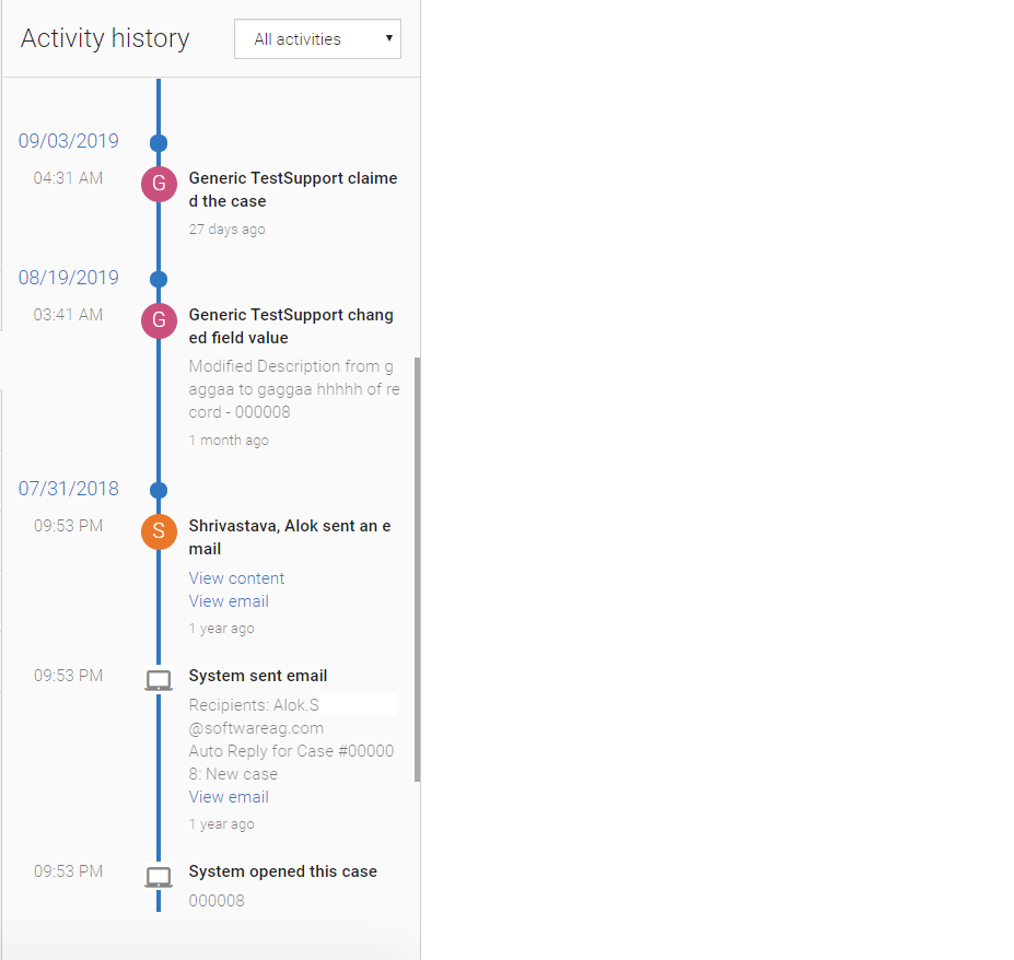
Activity History <ace-activity-history>
The Activity history allows you to display the activities performed on a record. Each entry in the activity history provides details about who did what, and when. It shows:
- Emails sent by platform user or by the user.
- Messages received through the Email Channel (generally as a reply to a message that was sent).
- Any private notes added to a record.
- The new old values of any Audited Fields. For Cases, all fields are audited by default. For example, any change to the Status or Priority of a case record is automatically recorded in the case history. For other objects, you must explicitly enable the field auditing.
- Following is an example for Activity History:

HTML Tag with Attributes
The following section provides details on the HTML tags with its associated attributes for Activity History:

The following table provides details for the HTML attributes:
Attributes Type Required/Optional Description object-id String Required Provide the object ID. record-id String Required Provide the record ID of the object for which you want to see the activity. id String Required Provide the unique identifier for the DOM elements. is-dropdown-visible Boolean Optional If value is true, then provide the drop-down to filter the activity history. Following are the options: - All activities
- My activities
- Updates
- Messages & notes
- Files attached
By default value is false. In the above snapshot, filter option is visible.
css-classlist String Optional Override the styling for activity history. You can pass the list of class by space separator to override the style.
Application Tabs List <ace-app-tabs-list>
This lists all the application tabs in an application. It includes objects, JSP pages, Web tabs, and so on. An example for the Application Tabs list is as follows:

HTML Tag with Attributes
The following section provides details about the HTML tags with its associated attributes for Application Tabs List:

The following table provides the HTML details for the Input attributes:
Attributes Type Required/Optional Description css-classlist String Optional Override the styling of component. You can pass the list of class by space separator to override the style.
The following table provides the HTML details for the Output Events:
Event Name Return Type Required/Optional Description Sample Example selectionChange JS Object. The format is as follows: { canAdd: true, id: "cases, singularTitle: "Case", title: "Cases", type: "object" uri?: "https://google.co.in", webtabname?: "google.co.in" }Optional Provide the application tab data on active of any tab. Following code listens to the change event on the application tab element. // HTML element <ace-app-tabs-list id="appTabs"></ace-app-tabs-list> // JS code const tabsList = document.querySelector('#appTabs'); tabsList.addEventListener('selectionChange', function (eventData) { const recordData = eventData['detail']; })
Login Form <ace-login-form>
You can use the Login Form component for any application login page. You can write your own logic using the success or failure handlers of this component.
The following image is an example for the Login form:

HTML Tag with Attributes
The following section provides details about the HTML tags with its associated attributes for Login Form:

The following table provides the HTML details for the Input attributes:
Attributes Type Required/Optional Description css-classlist String Optional Override the styling of Login Form. You can pass the list of class by space separator to override the style.
The following table provides the HTML details for the Output Events:
Event Name Return Type Required/Optional Description Sample Example loginSuccess JS Object. Optional This gives the response for successful login. Following code listens to the change event on the login form for successful login. // HTML element <ace-login-form id="LoginForm" css-classlist="mat-typography bg-transparent"> </ace-login-form> // JS code document.querySelector('#LoginForm').addEventListener('loginSuccess', function (eventData) { login_error_elem.innerHTML = ` <h4 class="alert-heading">Login Success!</h4> <p> Successfully logged in </p>`; login_error_elem.style.display = "block"; login_error_elem.className = "alert alert-success "; })loginError JS Object. Optional This gives the response for login failure. Following code listens to the change event on the login form for login failure. // HTML element <ace-login-form id="LoginForm" css-classlist="mat-typography bg-transparent"> </ace-login-form> // JS code document.querySelector('#LoginForm').addEventListener('loginError', function (eventData) { login_error_elem.innerHTML = ` <h4 class="alert-heading">Login Error!</h4> login_error_elem.style.display = "block"; login_error_elem.className = "alert alert-danger"; })
Notes Editor <ace-notes-editor>
Notes editor may be Private notes or Email messages. You can create it when viewing a Case record or some other record and they are stored in the record history.
The following image is an example for the Email message:

The following image is an example for Private note:

HTML Tag with Attributes
The following section provides details about the HTML tags with its associated attributes for Notes Editor:

The following table provides the HTML details for the Input attributes:
Attributes Type Required/Optional Description object-id String Required Provide the application object ID. record-id String Required Provide the record id of the object for which you want to add the notes. css-classlist String Optional Override the styling of Notes Editor. You can pass the list of class by space separator to override the style. action-panel "top" | "bottom" | "hide" align="left"|Optional default = top. This is the default location for the action panel of the Notes-editor. Usage:
- "top" = displays on the top of the notes-editor.
- "bottom" = displays on the bottom of the notes-editor.
- "hide" = Hides the action-buttons from the notes-editor component.
action-button "start" | "center" | "end" | "between" | "around" | "evenly" align="left"|Optional default = start. This is the default location for the action button of the Notes Editor. Usage:
- "start" = displays the SAVE and CANCEL button on the left side.
- "center" = displays the SAVE and CANCEL button in the center.
- "end" = displays the SAVE and CANCEL button on the right side.
- "between" = displays the SAVE and CANCEL button between the left side and the right side.
- "around" = displays the SAVE and CANCEL button with a space.
- "evenly" = displays the SAVE and CANCEL button with equal space.
The following table provides the HTML details for the Output Events:
Event Name Return Type Required/Optional Description Sample Example saveNote JS Object. The format is as follows: Key Value Data event.data Message Notes saved succc
Optional This gives the successful/failure message with data object on saving the note. Following code listens to the change event on the Notes Editor. // HTML element <ace-notes-editor id="noteseditor" object-id="cases" record-id="23334543"> </ace-notes-editor> // JS code const notesEditor = document.querySelector('#noteseditor'); notesEditor.addEventListener('saveNote', function (eventData) { const saveNoteData = eventData['detail']; })