Smart Components for AgileApps
Introduction
The runtime UI components in AgileApps platform are exported as HTML element tags (custom elements) to customize the platform user interface. All the custom elements can make REST API calls internally and hence are knows as Smart Components.
You do not need to invoke API calls to render data in the Smart Components. The Smart Components use internal API calls to perform CRUD operations on records. Inputs to the APIs are usually passed as DOM attributes to the custom elements. Most of the Smart components are able to accept input parameters and some of them are also able to dispatch certain element specific events.
If there are any future updates to the internal APIs used in the smart components, the internal implementation of Smart components would be updated. The customized UI need not be updated upon every version/patch release of the platform, in usual circumstances.
The following Smart Components are currently available:
- Activity History <ace-activity-history>
- Application tabs list <ace-app-tabs-list>
- Login Form <ace-login-form>
- Notes Editor <ace-notes-editor>
- Object view list <ace-object-views-list>
- Owner Assignment <ace-owner-assign>
- Record Attachment <ace-record-attachment>
- Record Form <ace-record-form>
- Record Process <ace-record-process>
- Records view <ace-records-table-view>
- Record Task <ace-record-task-view>
- Related information <ace-related-info>
- Table grid <ace-table-grid>
- View Configuration <ace-view-configuration>
Activity History <ace-activity-history>
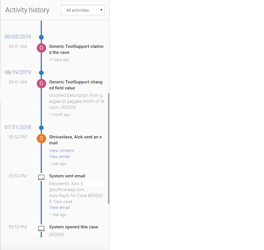
The Activity history allows you to display the activities performed on a record. Each entry in the activity history provides details about who did what, and when. It shows:
- Emails sent by platform user or by the user.
- Messages received through the Email Channel (generally as a reply to a message that was sent).
- Any private notes added to a record.
- For Cases, all fields are audited by default. For example, any change to the Status or Priority of a case record is automatically recorded in the case history. For other objects, you must explicitly enable the field auditing.
- Following is an example for Activity History:

HTML Tag with Attributes
The following section provides details on the HTML tags with its associated attributes for Activity History:
<ace-activity-history object-id="cases" record-id="23232234" id="activityHistoryRef">
</ace-activity-history>
The following table provides details for the HTML attributes:
Attributes Type Required/Optional Description object-id String Required Provide the object ID. record-id String Required Provide the record ID of the object for which you want to see the activity. id String Optional Provide the unique identifier for the DOM elements. is-dropdown-visible Boolean Optional If value is true, then provide the drop-down to filter the activity history. Following are the options: - All activities
- My activities
- Updates
- Messages & notes
- Files attached
By default value is false. In the above snapshot, filter option is visible.
css-classlist String Optional Override the styling for activity history. You can pass the list of class by space separator to override the style.
Application Tabs List <ace-app-tabs-list>
This lists all the application tabs in an application. It includes objects, JSP pages, Web tabs, and so on. An example for the Application Tabs list is as follows:

HTML Tag with Attributes
The following section provides details about the HTML tags with its associated attributes for Application Tabs List:
<ace-app-tabs-list css-classlist='dotted-border'></ace-app-tabs-list>
The following table provides the HTML details for the Input attributes:
Attributes Type Required/Optional Description css-classlist String Optional Override the styling of component. You can pass the list of class by space separator to override the style.
The following table provides the HTML details for the Output Events:
Event Name Return Type Required/Optional Description Sample Example selectionChange JS Object. The format is as follows: { canAdd: true, id: "cases, singularTitle: "Case", title: "Cases", type: "object" uri?: "https://google.co.in", webtabname?: "google.co.in" }Optional Provide the application tab data on clicking any tab. Following code listens to the change event on the application tab element. // HTML element <ace-app-tabs-list id="appTabs"></ace-app-tabs-list> // JS code const tabsList = document.querySelector('#appTabs'); tabsList.addEventListener('selectionChange', function (eventData) { const recordData = eventData['detail']; })
Login Form <ace-login-form>
You can use the Login Form component for any application login page. You can write your own logic using the success or failure handlers of this component.
The following image is an example for the Login form:

HTML Tag with Attributes
The following section provides details about the HTML tags with its associated attributes for Login Form:
<ace-login-form id="LoginForm"
                    css-classlist="mat-typography bg-transparent border border-info px-4 py-2">
                  </ace-login-form>
The following table provides the HTML details for the Input attributes:
Attributes Type Required/Optional Description css-classlist String Optional Override the styling of Login Form. You can pass the list of class by space separator to override the style.
The following table provides the HTML details for the Output Events:
Event Name Return Type Required/Optional Description Sample Example loginSuccess JS Object. Optional This gives the response for successful login. Following code listens to the change event on the login form for successful login. // HTML element <ace-login-form id="LoginForm" css-classlist="mat-typography bg-transparent"> </ace-login-form> // JS code document.querySelector('#LoginForm').addEventListener('loginSuccess', function (eventData) { console.log('login successful'); })loginError JS Object. Optional This gives the response for login failure. Following code listens to the change event on the login form for login failure. // HTML element <ace-login-form id="LoginForm" css-classlist="mat-typography bg-transparent"> </ace-login-form> // JS code document.querySelector('#LoginForm').addEventListener('loginError', function (eventData) { console.log('login failed'); })
Notes Editor <ace-notes-editor>
Notes editor may be Private notes or Email messages. You can create it when viewing a Case record or some other record and they are stored in the record history.
The following image is an example for the Email message:

The following image is an example for Private note:

HTML Tag with Attributes
The following section provides details about the HTML tags with its associated attributes for Notes Editor:
<ace-notes-editor id="record-detail-ace-notes-editor"
object-id="cases" record-id="23334543"
action-panel="bottom" action-button="evenly"></ace-notes-editor>
The following table provides the HTML details for the Input attributes:
Attributes Type Required/Optional Description object-id String Required Provide the application object ID. record-id String Required Provide the record id of the object for which you want to add the notes. css-classlist String Optional Override the styling of Notes Editor. You can pass the list of class by space separator to override the style. action-panel "top" | "bottom" | "hide" align="left"|Optional default = top. This is the default location for the action panel of the Notes-editor. Usage:
- "top" = displays on the top of the notes-editor.
- "bottom" = displays on the bottom of the notes-editor.
- "hide" = Hides the action-buttons from the notes-editor component.
action-button "start" | "center" | "end" | "between" | "around" | "evenly" align="left"|Optional default = start. This is the default location for the action button of the Notes Editor. Usage:
- "start" = displays the SAVE and CANCEL button on the left side.
- "center" = displays the SAVE and CANCEL button in the center.
- "end" = displays the SAVE and CANCEL button on the right side.
- "between" = displays the SAVE and CANCEL button between the left side and the right side.
- "around" = displays the SAVE and CANCEL button with a space.
- "evenly" = displays the SAVE and CANCEL button with equal space.
The following table provides the HTML details for the Output Events:
Event Name Return Type Required/Optional Description Sample Example saveNote JS Object. The format is as follows: Key Value Data event.data Message Notes saved successfully
Optional This gives the successful/failure message with data object on saving the note. Following code listens to the change event on the Notes Editor. // HTML element <ace-notes-editor id="noteseditor" object-id="cases" record-id="23334543"> </ace-notes-editor> // JS code const notesEditor = document.querySelector('#noteseditor'); notesEditor.addEventListener('saveNote', function (eventData) { const saveNoteData = eventData['detail']; })
The following table provides the HTML details for the Component Instance Methods:
Method Name Description Sample Example inputContent(noteObj) Use this to save the record. Here noteObj is a parameter of type object. It should have two properties subject and content. Pass the input content to the Notes Editor as follows: // HTML elements <ace-notes-editor object-id="cases" record-id="12345" id="notesEditor"></ace-notes-editor> // JS script <script> const notesEditor = document.querySelector('#notesEditor'); function updateNotes() { const noteObj = { subject: 'My First Note', content: 'Hello world !!!' }; notesEditor.inputContent(noteObj); } </script>saveNote() Use this to save the Notes Editor changes. Pass the following for saving the record notes: <button onclick="saveNote()">SAVE</button> <ace-notes-editor id="notes-editor" object-id="cases" record-id="1026401569" css-classlist="bg-white border border-secondary px-4 py-2"> </ace-notes-editor> <script> function saveNote(){ const notesEditor = document.querySelector('#notes-editor'); dynamicRef.saveNotes(); } </script>
Object View List <ace-object-views-list>
It lists all the views inside an object with record count. The following image is an example for the Object View List:

HTML Tag with Attributes
The following section provides details about the HTML tags with its associated attributes for Object View List:
<ace-object-views-list object-id="cases" id="listOfViews"></ace-object-views-list>
The following table provides the HTML details for the Input attributes:
Attributes Type Required/Optional Description object-id String Required Provide the application object ID. It fetches the list of views present for that object. css-classlist String Optional Override the styling of Object View List. You can pass the list of class by space separator to override the style.
The following table provides the HTML details for the Output Events:
Event Name Return Type Required/Optional Description Sample Example selectionChange JS Object. The format is as follows: Key Value Count 12 Default 0 Id cases IsActive false IsSelectedAsTab false Name All Active Cases SortBy last_activity SortOrder desc ViewCreatedBy 0 ViewObjectId cases
Optional This gives the metadata of the selected view. Following code listens to the change event on the Object View List component. // HTML element <ace-object-views-list object-id="cases" id="listOfViews"></ace-object-views-list> //JS script const objectViewList = document.querySelector('#listOfViews'); objectViewList.addEventListener('selectionChange', function (eventData) { const recordData = eventData['detail']; })
Owner Assignment <ace-owner-assign>
Use this component to assign a record to a user or a team or have it assigned to yourself. It auto suggests the names while typing in the Assignee field. The Assign to me link assigns the record to the logged-in(current) user.
The following image is an example for the Owner Assignment component:

HTML Tag with Attributes
The following section provides details about the HTML tags with its associated attributes for Owner Assignment:
<ace-owner-assign id="ownerAssign" object-id="cases" record-id="1554361346" show-users="true" show-teams="true" self-claim="true"></ace-owner-assign>
The following table provides the HTML details for the Input attributes:
Attributes Type Required/Optional Description object-id String Required Provide the application object ID. record-id String Required Provide the application record ID. show-users String Required Possible values are true or false. It decides whether to show the users list or not. show-teams String Required Possible values are true or false. It decides whether to show the list of teams or not. self-claim String Required Possible values are true or false. It decides whether to show the Assign to me link or not. css-classlist String Optional Override the styling of Owner Assignment component. You can pass the list of class by space separator to override the style.
The following table provides the HTML details for the Output Events:
Event Name Return Type Required/Optional Description Sample Example assignedRecord JS Object. The format is as follows: Key Value Data 2566523 Message Record assigned successfully.
Optional This gives the success or failure message for record assignment. Following code listens on successfully assigning a record: // HTML elements <ace-owner-assign id="ownerAssign" object-id="cases" record-id="1554361346" show-users="true" show-teams="true" self-claim="true"></ace-owner-assign> //JS script const ownerComponent = document.querySelector('#ownerAssign'); notesEditor.addEventListener('assignedRecord', function (eventData) { const saveData = eventData['detail']; })
The following table provides the HTML details for the Component Instance Methods:
Method Name Description Sample Example assignedRecord() Use this method to assign the record to a user or a team only. Call the assignedRecord method as follows: // HTML elements <button onclick="assignRecord()">assign</button> //JS script <script> function assignRecord(){ const ownerAssign = document.querySelector('#ownerAssign'); ownerAssign.assignRecord(); } </script>claimRecord() Use this method to claim the record to the currently active user. Call the claimRecord method as follows: // HTML elements <button onclick="claimRecord()">assign</button> //JS script <script> const ownerAssignEle = document.querySelector('#ownerAssign'); function claimRecord() { ownerAssignEle.claimRecord(); } </script>
Record Attachment <ace-record-attachment>
This component allows you to attach attachments to a record and to display the files attached .It also displays the list of files attached through Notes Editor.
The following image is an example for the Attachments list:

The following image is an example for the Attach File dialog:

HTML Tag with Attributes
The following section provides details about the HTML tags with its associated attributes for the Record Attachment component:
<ace-record-attachment id="ace-record-attachment" object-id="cases" record-id="1186807729"></ace-record-attachment>
The following table provides the HTML details for the Input attributes:
Attributes Type Required/Optional Description object-id String Required Provide the application object ID. view-id String Required Provide the view ID of the object. css-classlist String Optional Override the styling of Record Attachment component. You can pass the list of class by space separator to override the style. attachment-header String Optional This attaches the header name. Default='show'. Possible values are:
- "show" = displays on top of the record-attachment.
- "hide" = Hides the record-attachment header from component.
thumbnail-image String Optional Default value = 'show'. Possible values are: - "show" = displays the thumbnail on the left of the attachment.
- "hide" = Hides the thumbnail.
delete-button String Optional Use this to show the Delete button. The default value ='show'. Possible values are: - "show" = displays the attachment-delete button to the right of the attachment.
- "hide" = Hides the attachment-delete button.

Note: Output Events are not applicable for Record Attachment component.
The following table provides the HTML details for the Component Instance Methods:
Method Name Description Sample Example openAttachDialog() Use this method to add a new attachment and to open the Attach file dialog for that attachment. The code sample for the openAttachDialog() method is as follows: // HTML elements <button onclick="openDialog()">Open Attachment Dialog</button> <ace-record-attachment id="attachment" object-id="cases" record-id="12455683" attachment-header='show' thumbnail-image='hide' delete-button='hide'> </ace-record-attachment> // JS script <script> const recordAttachment = document.querySelector('#attachment'); function openDialog() { recordAttachment.openAttachDialog(); } </script>deleteAttachment(index) Use this method to delete the existing attachment. Here use the parameter index to define which list element to delete. Call the deleteAttachment(index) method as follows: // HTML elements <button onclick="deleteAttachment()">Delete Attachment</button> <ace-record-attachment id="attachment" css-classlist="bg-white" object-id="xxxxx" record-id="xxxxx"> </ace-record-attachment> // JS script <script> const recordAttachment = document.querySelector('#attachment'); function deleteAttachment() { recordAttachment.deleteAttachment(0); } </script>
Record Form <ace-record-form>
Record Form is one of the most important components available in AgileApps. You can create, update and clone a record by using <ace-record-form>.
The following image is an example for the Record Form component:

HTML Tag with Attributes
The following section provides details about the HTML tags with its associated attributes for the Record form component:
<ace-record-form object-id="cases" record-id="43334342" id="recordFormId" css-classlist="bg-white border-0 p-0">
</ace-record-form>
The following table provides the HTML details for the Input attributes:
Attributes Type Required/Optional Description object-id String Required Provide the application object ID. record-id String Required Provide the record ID of the object for which you want to view the record details. For a new record, set record-id='1'. css-classlist String Optional Override the styling of Record form component. You can pass the list of class by space separator to override the style. display-mode "accessibility" | "View" Optional default = "". These are the different display modes for the field. Usage:
- "accessibility" = displays in Accessibility mode.
- "view" = displays in View mode.
- "" = displays the default display mode.
formDisplayMode String Optional Default value = "". Usage:
- "printmode" = displays the sections in an expansion panel.
layout-id String Optional Layout ID of the form. record-form-extras String Optional Record form extras should be a string and it accepts the key value pairs separated by a colon (:) and properties are separated by a comma. Usage:
- record-form-extras="skipLocationChange:true". Here the skipLocationChange is true is used to prevent the navigation of the lookup field and it gives the information of the selected record in the lookup field.
The following table provides the HTML details for the Output Events:
Event Name Return Type Required/Optional Description Sample Example loadRecordForm JS Object. The format is as follows: Key Value Account {"name":"test123","id":"1111079810"} Attachment Cases_testdatetime_1575840529 07/10/2019 05:18 PM Cases_testpicklist_1575840529 Contact {"name":"","id":""} Description t20 Owner_id {"name":"schindler schindler","id":"b44e3cca159f4954b176cc988c4dc8c7"} Priority 3 Status 1 Subject t20i Test_formula2_1575840529 Test_formula_1575840529 Type 1
Optional This event gives the record data on loading of the form for an object. Following code listens to the change event for this component. // HTML element <ace-record-form object-id="cases" record-id="43334342" id="recordFormId"> </ace-record-form> // JS code const taskComponent = const rfEle = document.querySelector('#recordFormId'); rfEle.addEventListener('loadRecordForm', function (eventData) { const onLoadData = eventData['detail']; })saveRecordForm JS Object. The format is as follows: Key Value Account {"name":"test123","id":"1111079810"} Attachment Cases_testdatetime_1575840529 07/10/2019 05:18 PM Cases_testpicklist_1575840529 Contact {"name":"","id":""} Description t20 Owner_id {"name":"schindler schindler","id":"b44e3cca159f4954b176cc988c4dc8c7"} Priority 3 Status 1 Subject t20i Test_formula2_1575840529 Test_formula_1575840529 Type 1
Optional When you save a record, it gives the record data in the form of an object. Following code listens to the change event for this component. // HTML element <ace-record-form object-id="cases" record-id="43334342" id="recordFormId"> </ace-record-form> // JS code const rfEle = document.querySelector('#recordFormId'); rfEle.addEventListener('saveRecordForm', function (eventData) { const onSaveData = eventData['detail']; })resetRecordForm JS Object. The format is as follows: Key Value Account {"name":"test123","id":"1111079810"} Attachment Cases_testdatetime_1575840529 07/10/2019 05:18 PM Cases_testpicklist_1575840529 Contact {"name":"","id":""} Description t20 Owner_id {"name":"schindler schindler","id":"b44e3cca159f4954b176cc988c4dc8c7"} Priority 3 Status 1 Subject t20i Test_formula2_1575840529 Test_formula_1575840529 Type 1
Optional When you reset or cancel a record, it gives the record data in the form of an object. Following code listens to the change event for this component. // HTML element <ace-record-form object-id="cases" record-id="43334342" id="recordFormId"> </ace-record-form> // JS code const rfEle = document.querySelector('#recordFormId'); rfEle.addEventListener('resetRecordForm', function (eventData) { const onResetData = eventData['detail']; })navigateToLookupRecord JS Object. The format is as follows: Key Value ObjectId cases RecordId 1920107811 Row {"last_activity_v":"12/09/2019 11:43","owner_id":{"name":"Mounika c","id":"a6d4c192fb8d49c599e583d5db0ecaff"},"priority_value":"3","subject":"t","source":"Agent","from_name":"c","priority":"P3","object_id":"cases","last_activity":"2 hours ago","record_locator":"001442 - t","contact":{"name":"c","id":"1493009286"},"case_number":"001442","submitter_photo_id":"","id":"1920107811","notifications":[],"status":"New"}
Optional When you click the lookup field navigation link, it gives the selected record information. The record-form-extras input should have skipLocationChange:true. Following code listens to the change event for this component. // HTML element <ace-record-form object-id="cases" record-id="43334342" id="recordFormId"> </ace-record-form> // JS code const rfEle = document.querySelector('#recordFormId'); rfEleme.addEventListener('navigateToLookupRecord', function (eventData) { const lookupRecordInfo = eventData['detail']; });tabChange JS Object. The format is as follows: Key Value currentTab {id: "7346b58d24c64273981109b79999c6eb" ,index: 1, title: "Record Information"} previousTab {id: "ea00a656e15c4eae8e29fada5f54e140" ,index: 0, title: "Basic Information"} tabList [{title: "Basic Information", id: "ea00a656e15c4eae8e29fada5f54e140"} , {title: "Record Information", id: "7346b58d24c64273981109b79999c6eb"}]
Optional When you change a section, it gives the selected section information. Following code listens to the change event for this component. // HTML element <ace-record-form object-id="cases" record-id="43334342" id="recordFormId"> </ace-record-form> // JS code const rfEle = document.querySelector('#recordFormId'); rfEleme.addEventListener('tabChange', function (eventData) { const lookupRecordInfo = eventData['detail']; });
Record Process <ace-record-process>
Use this component to show the list of processes associated with the respective records. Individual process can have respective action items like Start, Stop, and Remove if the process is not complete.
The following image is an example for the Record Process component:

HTML Tag with Attributes
The following section provides details about the HTML tags with its associated attributes for the Record Process component:
<ace-record-process id="recordProcess" object-id="cases" record-id="407302262"></ace-record-process>
The following table provides the HTML details for the Input attributes:
Attributes Type Required/Optional Description object-id String Required Provide the application object ID. It fetches the list of views present for that object. record-id String Required Provide the record ID of the object for which you want to view the process list. css-classlist String Optional Override the styling of Record Process component. You can pass the list of class by space separator to override the style.
Records view <ace-records-table-view>
Use this Records view component to display a list of records which is shown in a grid; for example, a spreadsheet. You need to specify the object-id, view-Id of the object to render the list of records. An example for the grid is as follows:

HTML Tag with Attributes
The following section provides details about the HTML tags with its associated attributes for the Records View component:
<ace-records-table-view id="listOfRecords" object-id="cases" view-id="c8b87852af5f4828977ab6c9c8bec8fc"></ace-records-table-view>
The following table provides the HTML details for the Input attributes:
Attributes Type Required/Optional Description object-id String Required Provide the application object ID. It fetches the list of views present for that object. view-id String Required Provide the view ID of the object for which you want to view the records. total-count Number Optional The default value is zero. If the count is more than 25, the pagination button is enabled to move to the next or previous set of records. A maximum of 25 records is shown in the grid view. To access the rest of the records, use pagination by passing the total count value. If you do not pass the total count value or if the value is zero, this section is not shown on the application UI. css-classlist String Optional Override the styling of the Records View component. You can pass the list of class by space separator to override the style. enable-sorting Boolean Optional The default value is true. If the value is false, then it disables the header sorting. enable-paginator Boolean Optional The default value is true. If the value is false, then it disables the pagination. sort-by String Optional The default value is date_modified. This component accepts the field name. Usage:
- sort-by='id'
sort-order String Optional The default value is desc. This component defines the order in which the rows have to be sorted. Usage:
- sort-order='asc'
singular-objectname String Optional The default value is case. This value is shown for case number column heading.
The following table provides the HTML details for the Output Events:
Event Name Return Type Required/Optional Description Sample Example selectionChange JS Object. The format is as follows: Response data { isAllSelected: false, listOfRecordSelected: [{ case_number: "000039", id: "1108141875", last_activity: "3 days ago", last_activity_v: "08/01/2019 05:04 AM", notifications: [], object_id: "cases", owner_id: { name: "dave", id:"abcd1234" }, priority: "P3", priority_value: "3", record_locator: "000039", source: "Agent", status: "New", subject: "", submitter_photo_id: "" }], numberOfRecordsSelected: 1 }
Optional When you click a checkbox on any of the records, it provides that record's data in the form of an object. The checkbox is available only for task, and case type objects. Following code listens to the change event for this component. // HTML element <ace-records-table-view id="listOfRecords" object-id="cases" view-id="c8b87852af5f4828977ab6c9c8bec8fc" enable-sorting="true" enable-paginator="true" sort-by="date_modified" sort-order="desc" total-count="25" css-classlist="p-1"> </ace-records-table-view> // JS code const recordsTableViewElem = document.querySelector('#listOfRecords'); recordsTableViewElem.addEventListener('selectionChange', function (eventData) { const recordData = eventData['detail']; })currentRecordInfo JS Object. The format is as follows: Response data { objectId: "cases", recordId: "731024800", row :{ case_number: "000032", contact: "", from_name: "shashank g", id: "731024800", last_activity: "6 days ago", last_activity_v: "10/16/2019 06:16 AM", notifications: [], object_id: "cases", owner_id: { name: "shashank g", id: "faeb419f79a448d096af739f505a408d" }, priority: "P3", priority_value: "3", record_locator: "000032", source: "Agent", status: "New", subject: "qeewadslklkjds", submitter_photo_id: "" } }
Optional When you click the record locator, the record information is provided. Following code listens to the change event for this component. const recordsTableViewElem = document.querySelector('#recordsTableView'); recordsTableViewElem .addEventListener('currentRecordInfo', function (eventData) { const recordData = eventData['detail']; })
Record Task <ace-record-task-view>
Use this component to create a task related to a record like:
- Single step task
- Multi step task
- Task form
Single step task and individual steps of Multi step task are like a quick card of the task form, where you are able to add minimal information and create the tasks. The Task form shows all the fields of the task object form.
You can complete, approve, or reject a task using this component.
Following is an example of the Record Task list:

Following is an example of the Add new task dialog box:

HTML Tag with Attributes
The following section provides details about the HTML tags with its associated attributes for the Records Task component:
<ace-record-task-view id="recordTaskView" object-id="cases" record-id="407302262"></ace-record-task-view>
The following table provides the HTML details for the Input attributes:
Attributes Type Required/Optional Description object-id String Required Provide the application object ID. It fetches the list of views present for that object. record-id String Required Provide the record ID of the object for which you want to view the list of tasks. css-classlist String Optional Override the styling of the Record Task component. You can pass the list of class by space separator to override the style.
The following table provides the HTML details for the Output Events:
Event Name Return Type Required/Optional Description Sample Example taskDoneStatus JS Object. The format is as follows: Key Value message Task completed successfully. Data 25536598
Optional This event gives the success or failure message when a task is completed, approved, or rejected. Following code listens to the change event for this component. // HTML element <ace-record-task-view id="recordTaskView" object-id="cases" record-id="407302262"></ace-record-task-view> // JS code const taskComponent = document.querySelector('#recordTaskView'); notesEditor.addEventListener('taskDoneStatus', function (eventData) { const saveData = eventData['detail']; })
A related record is a record which is linked to the current record through a lookup field. While viewing a record, you should be able to see the related records associated with it. You can add more related records.
A Related Information section is created automatically whenever you create a standard Lookup field, or when you define a one-to-many object relationship (which creates the Lookup field automatically). The default section title is the object name, and the section includes a button to create a new record which is a singular name of the object. When editing the Form, you can remove any related information sections which you do not want to show. You can always include them later manually, if needed.
When you define an External Data Source, specify the object fields used to identify related records from the external data store. Those records are retrieved from the external source when the form is displayed. Following is an example of related with the list of records:

HTML Tag with Attributes
The following section provides details about the HTML tags with its associated attributes for the Related information component:
<ace-related-info object-id="cases" record-id="801173855"></ace-related-info>
The following table provides the HTML details for the Input attributes:
Attributes Type Required/Optional Description object-id String Required Provide the application object ID. It fetches the list of views present for that object. record-id String Required Provide the record ID of the object for which you want to view the related information. css-classlist String Optional Override the styling of the Related information component. You can pass the list of class by space separator to override the style.
Table grid <ace-table-grid>
Use this component to create a table grid and to display the fetched data for an object using REST API. Some of the examples are Lookup field dialog, merge record dialog, visibility controls selector, search results table, and so on.
Some of the table features are as follows:
- The grid has 5 records initially (it should be configurable).
- The grid supports pagination.
- The grid has filters where you can provide input.
- The grid headers are sort-able with filter and with out filter.
- When you search without having input, it resets the grid result.
- Each row of the table can be viewed as a card (for mobile/small screen device).
HTML Tag with Attributes
The following section provides details about the HTML tags with its associated attributes for the Table grid component:
<ace-table-grid id="tableGridId" object-id="cases" row-view="card"></ace-table-grid>
The following table provides the HTML details for the Input attributes:
Attributes Type Required/Optional Description object-id String Required Provide the application object ID. It fetches the list of views present for that object. column-meta String Optional Pass the list of column information. Default record locator is seen. The field metadata is separated by '@|@' in the following manner: field1_name:field1_Label:field_type:isHidden:IsSortable@|@field2_name:field2_Label:field_type:isHidden:isSortableFor example: subject:Subject:STRING:false:true@|@description:Description:STRING:true:false@|@status:Status:PICK_LIST:false:trueallow-multi-select String Optional The default value is false. If it is true, then you can select multiple records. page-size Number Optional The default value is 5. Provide the number to display that many records in a page. input-filter String Optional The default value is true. It provides the filter(search) functionality for grid data. When the value is true, this filter is enabled. can-paginate String Optional The default value is true. If it is false, it will not show the pagination and shows the first number of records which is page-size. default-filter-query String Optional The default value is empty string. You can set a filter like default-filter-query='subject equals mysubjecttext'. sort-by String Optional The default value is date_modified. You can set some other fields to sort the records by that field. For example sort-by='id'. sort-order String Optional The default value is desc. It sets the sort order by field. To show in ascending order, you have to set sort-order='asc'. row-view String Optional If you want each row of the table to show as a card like view (for small screen device), then provide this attribute: row-view="card"
The following table provides the HTML details for the Output Events:
Event Name Return Type Required/Optional Description Sample Example selectionChange JS Object. The format is as follows: Description Id Record_locator Subject Total desc 1534812301 000011 - test test desc 806750231 000013 - test new test new
Optional This event for the component provides the details for the selected record. Following code listens to the change event for this component. // HTML element <ace-table-grid id="tableGridId" object-id="cases" column-meta="subject:Subject:STRING:false:true@|@description:Description:STRING:true:false@|@status:Status:PICK_LIST:false:true" page-size="7" input-filter="true" can-paginate="true" allow-multi-select="true" default-filter-query="subject equals test" sort-by="subject" sort-order="asc"> </ace-table-grid> // JS code const tableGridElem = document.querySelector('#tableGridId'); tableGridElem.addEventListener('selectionChange', function (data) { const selectionData = data.detail; if (selectionData.length) { console.log(selectionData); } });pageSortChange The format is as follows: Key Value PageIndex 0 PageSize 7 PageTotalLength 37 SortActive subject SortDirection desc
Optional This event provides the pagination information for a field. Following code listens to the change event for this component. // HTML element <ace-table-grid id="tableGridId" object-id="cases" page-size="7" input-filter="true" can-paginate="true" allow-multi-select="true" default-filter-query="subject equals test" sort-by="subject" sort-order="asc"> </ace-table-grid> // JS code const tableGridElem = document.querySelector('#tableGridId'); tableGridElem.addEventListener('pageSortChange', function (data) { const selectionData = data.detail; });
View Configuration <ace-view-configuration>
Use this component to configure a new view or edit an existing view for an object.
The following image is an example for the View Configuration component:

HTML Tag with Attributes
The following section provides details about the HTML tags with its associated attributes for the View Configuration component:
<ace-view-configuration id="viewConfigComponent"
css-classlist="mat-typography bg-transparent border border-info px-4 py-2"
object-id="cases" view-id='-1'></ace-view-configuration>
The following table provides the HTML details for the Input attributes:
Attributes Type Required/Optional Description object-id String Required Provide the application object ID. It fetches the list of views present for that object. css-classlist String Optional Override the styling of View Configuration component. You can pass the list of class by space separator to override the style view-id String Required Provide the Id of an existing view. For a new view, this value should be ='-1'
The following table provides the HTML details for the Output Events:
Event Name Return Type Required/Optional Description Sample Example selectionChange JS Object. The format is as follows: Key Value Data event.detail Message ID of the view
Optional This provides the success or failure message with data object when you save a view. Following code listens to the change event for this component. // HTML element <ace-view-configuration id="viewConfigComponent" css-classlist="mat-typography bg-transparent border border-info px-4 py-2" object-id="cases" view-id='-1'></ace-view-configuration> // JS code <script> document.querySelector('#viewConfigComponent').addEventListener('saveView', function (eventData) {console.log(eventData) }); </script>
The following table provides the HTML details for the Component Instance Methods:
Method Name Description Sample Example submitViewData() Use this to save the view. Pass the input content to the Notes Editor as follows: // HTML elements <ace-view-configuration id="viewConfigComponent" css-classlist="mat-typography bg-transparent border border-info px-4 py-2" object-id="cases" view-id='-1'></ace-view-configuration> <button onclick="saveView()">save</button> // JS script <script> const viewRef= document.querySelector('#viewConfigComponent'); function SaveView() { viewRef.submitViewData(); } </script>saveAsNewView() Use this to save the Notes Editor changes. On saving the record notes: <button onclick="saveAsNew()">SAVEAs New</button> <ace-view-configuration id="viewConfigComponent" css-classlist="mat-typography bg-transparent border border-info px-4 py-2" object-id="cases" view-id='-1'></ace-view-configuration> <script> function saveAsNew(){ const viewRef= document.querySelector('#viewConfigComponent'); viewRef.saveAsNewView(); } </script>