Navigating the User Interface
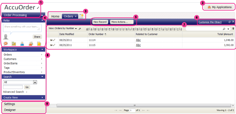
The elements that make up platform pages are shown here, with links to detailed information below.
- 1. Titles
- The name of your organization appears here. This is the tenant name. (Think of the platform as an office building. Each tenant is an organization, which can have multiple users.
- Below the organization is the name of the currently running application.
- 2. Applications Button
- Clicking this button gives you access to the world of applications available on the platform.
- 3. Tabs
- Every time you open an object record, a list-view of objects, or a report, a new tab is created in which to display it. Use the tabs to quickly shift your working context to the area you need to focus on.
- 4. Relay Social Networking Panel
- Use this area to post messages to your followers and to rapidly access the groups and documents you're following, as well as your profile page (your "wall") where all of your messages are aggregated).
- 5. Action Buttons
- Click these buttons to take action. They manage records in the object, and allow customization of the object:
- Click the [New Record] button to add a new record to the Object
- Click [More Actions] for a list of operations you can apply to multiple records at one time
- 6. Links and Icons
- Along with Action buttons, Links and Icons provide access to platform functionality. The basic set shown here includes:
- Learn more: Using Icons in Data Entry Forms
- 7. Content Pane
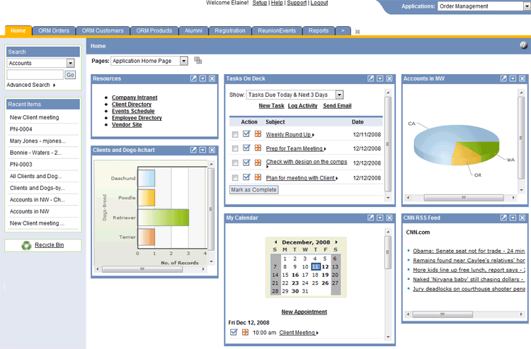
- The content in the body of a page varies. It can be a List View, which will be discussed shortly, a Record View, a dashboard full of Widgets as shown below, a list of Reports or Documents, or many other things, depending on the tab that is currently selected.
- Widgets - A page of Widgets
- 8. Workspace
- The Workspace area shows provides a list of Objects and other platform elements that are part of the application. The Recycle Bin also appears here.
- In addition there is an area for searching and one for creating new things, each of which can be individually opened or closed.
- 9. Sidebar Buttons
- When the Workspace is open, the Settings and Designer areas are closed. Click Settings to personalize the platform and make other adjustments. Click Designer to access the full suite of platform customization capabilities.
Workspace > {object}
A List View displays a list of records. You can get to a List View by clicking any object in your application Workspace.
2.1 About the List View
The List or grid is the most common kind of multiple-record view, but there are other kinds of views as well. For example: Tree and Calendar displays. (Learn more: Views.)
In a List View, records are displayed in a grid, like a spreadsheet. At the top of the view, under the action buttons, a view control bar gives you many ways to control your view of the data:
- Choose from standard and custom Views to determine which records are selected and which information is displayed.
- Click the Wrench icon
 for a list of options you can use for Managing the View.
- Click a column heading to sort the records on that column.
(The column icon changes to show that it has been sorted.) - Click again to reverse the sort.
- Click an entry in the Alphabetic Index to limit the list to values starting with that letter in the most recently selected column.
- Type in a value and click the Magnifier icon
 to search for a record with that value. Click the down arrow to get a list of things you've searched on before.
 - Click the double down arrow icon
 to do advanced filtering:
- Things to know about filtering
- To apply a filter to a checkbox, use "1" for Yes/True and "0" for No/False values.
- Specify multiple values using the pipe "|" character. For example: "State equals CA|NY|MN"
- Specify an empty numeric field using BLANK. For example: "Phone equals BLANK"
- Specify an empty string field using two single-quotes with nothing between them: ('')
- Learn more:Complex Expressions
Note: The filter is not saved with the view. For details on how to include a filter in a View and save it for future use, see Filters.
2.2 Working with a List View
2.2.1 Sorting a List View
List Views can be sorted by clicking on a column heading. You can then choose between an Ascending and Descending sort.
2.2.2 Viewing and Editing Records
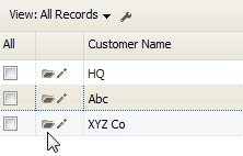
List Views for Objects contain these icons:
2.2.3 Searching a List View
At the top of the window, type text into the search field and press the Magnifier icon ![]() to select records whose contents contain the value you specify, or click the down arrow to select a recently-used search term.
to select records whose contents contain the value you specify, or click the down arrow to select a recently-used search term.
2.2.4 Printing Records
To print the view showing in the current page:
- Click the Wrench icon

- Click Print this View
The page of records you are currently viewing is displayed in a new window, as a preview. - Use the web browser controls to print the page or save it to a file.
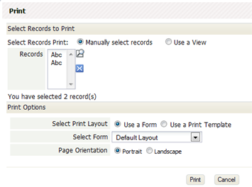
To print multiple records, or all records in a view:
- Click the [More Actions...] button
- Click Print
A dialog opens with additional options.
- You can choose to:
- Modify the list of records selected from the current view
- Choose one of the available views, to print all of the records it contains.
- Choose to format the records using an existing Form layout or a Print Template.
(If you choose Print Template, and none exist, a button appears to let you create one on the spot.) - Choose Portrait or Landscape mode for the printer
- A PDF containing the results is generated in the background, and a message is sent to your inbox when it is ready for you to download.
2.2.5 Customizing a List View
You can choose the columns that are displayed in the list, and the order in which they appear. You can make different views that are available to users in different roles.
- Learn more: Managing Views
Workspace > {object} > {record}
The Record View (also known as the Record Detail View) shows you information for a single record.
3.1 About the Record View
You open the Record View from an object View--typically, from a List View, as shown here, by clicking the Folder icon ![]() :
:
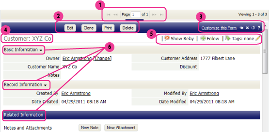
The parts of the record View are shown here, with links to detailed information below:
- 1.Page Control
- If more than one page is required to display information, this control shows you where you are, and lets you move from page to page.
- 2. Action Buttons
-
- You can define your own Action buttons, but these four are the default:
- [Edit] - Click this button to modify the record.
- [Clone] - To save yourself some work, make a copy of an existing record and then modify the fields that are different.
- [Print] - Create a PDF or HTML page from the record, formatting it using one of the standard or custom-build Forms or Print Templates. Then email page content, save it as a web page, or print it out. (More below)
- [Delete] - Delete the record. (If you find you need it later, check the Recycle Bin.)
- 3. Links and Icons
- These standard links and icons make your life easier:
- Customize this Form - A record is displayed using a Form. The default form is displayed, if no other form is chosen, or if the user's Role doesn't dictate the Form they see. When you have the appropriate privileges to modify Forms, this link is displayed. Click it to change which fields are displayed, the order in which they occur, and many other aspects of the Form.
- 4. Record Name
- The record "name" typically comes from the first field defined for the record. (It can be changed using Record Locators.) In this case, the Customer Name does a good job of identifying the record.
- 5. Social Networking (Relay) Operations and Tags
- Use these buttons to interact with Relay:
- Show Relay
- Display the Relay feed corresponding to this record, showing recent posts that were made about it. Add your own comments, if you like. (Changes to "Hide Relay" when the feed is displayed.)
- Follow
- Follow this record. That way, every new post made to this feed comes to your feed "aggregator", where you get posts from every record, group, and user you are following.
- Tags are free-form. You can type anything you want. But it helps to keep things consistent. The Tag dialog shows you tags that have been most recently used and tags that are most popular.
- Then, on your Home Page, create a Tag Cloud Widget to rapidly access records by their tags.
- 6. Collapsible Sections
- Sections can be collapsed by clicking the icon at the end of the heading.
- Basic Information
- The information shown is configurable, but the kind of information displayed in the screenshot above is fairly typical. The current record owner is shown, along with significant fields in the record.
- Record Information
- These are standard tracking fields defined by the platform, showing when the record was created, when it was last modified, and by whom.
- Related Information
- The Related Information section displays information from records that are related to this one.
- For example, Notes and Attachments records are displayed here. (You can also click a button to add a Note or an Attachment on the spot.) For a Customer object like this, the customer's Orders might well be displayed, if the application designer chooses to do so.
3.2 Working with the Record View
3.2.1 Printing a Record
- To print a Record
- Visit the Object Record.
- Click the [Print] button
A dialog box opens with printing options. - Choose your printing options:
- Choose to format the record using a Print Form or a Print Template.
(If you choose Print Template, and none exists, a button appears to let you create one on the spot.) - Choose Portrait or Landscape orientation for the printer
- Choose to Open in a New Window or Save as Document
The generated format depends on your choice and the type of template:
- Choose to format the record using a Print Form or a Print Template.
Save as Document Open in a New Window JSP template PDF HTML HTML template Word template Word document PowerPoint template PowerPoint file
3.2.2 Editing a Grid Section
In general, editing a record is a matter of filling in fields and clicking Lookup icons to select records. But records may also display related records (a collection of records that are related to the one you are viewing).
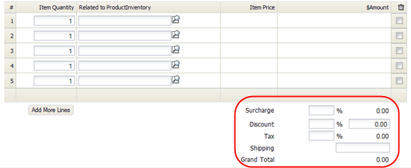
For example, an Orders record might contain a grid section that displays OrderItems, like the one shown here:
In a Grid Section, you:
- Fill in fields to create or edit related records.
- Click [Add More Lines] to make the grid section larger.
- Click the Trashcan checkbox at the end of a line to delete the row.
(The row is deleted when you [Save] the record the grid section is in.)
