Fields
Designer > Data > Objects > {object} > Fields
Fields are attributes of a Custom Object, and are used to contain many types of data:
- Fields are defined by giving them a label and specifying a Field Display Type
- New fields can be added to the Form Layout canvas
- Fields can have Role-Based Visibility, meaning that the field data is visible only to users who have permission rights for that field
- Fields can have a Default Value defined, which pre-populates the field in the data entry form (Form Layout)
- Default values can be created with Formula Fields
- Fields created by Users are listed as Custom in the Type column
Users that have the Customize Objects permission can edit Fields
Add Fields
Fields can be added to an Object from the Fields tab. Forms can be designed via Form Layouts.
Add a Field from the Fields Tab
Designer > Objects > {object} > Fields
Fields can be added to an object, customized, and displayed in a variety of ways.
Basic Information
Specify the basic characteristics of the field
- Label
- Enter a field label; This label is displayed on the Form
- Display Type
- The fields in this page will change, depending on the Field Display Type selected
- Always Required
- Checkbox
- (Optional) Include in Quick Edit
- This choice will appear for fields in these objects only: Prospects, Accounts or Contacts; See Quick Edit for more information
- Field Name
- The name that will be used to reference this object. Must conform to the Field Naming Rules
- (Optional) Mapped to Account Column
- This choice will appear for fields in Prospects only; Select a field in the Accounts object that will be mapped to this new field (When a Prospect is converted to an Account, this field value is copied to the specified Account field; The Account field is overwritten with the value in this field)
Display Attributes
This section is displayed when adding a new field. It specifies the default attributes for the field, when it appears in a Form.
- Section
- Select the section in the default form where the field will appear. (The Basic Information section is the default.)
- Required
- Checkbox
- Default is unchecked
- If checked, this field is required in the current Form
Default Value
- Specify the content to be displayed as the Default Value when adding a new record to this object, or use the interactive Formula Builder to define a default-value expression.
- Considerations
-
- For Lookup fields, the value must resolve to a record_id. (A user_id, for Lookups to the USER object.)
For example, this formula can be used to specify a default value for the record Owner, by using an email address to do the Lookup:
- LOOKUP('USER','id','email="newOwner@OurCompany.com"')
- For Lookup fields, the value must resolve to a record_id. (A user_id, for Lookups to the USER object.)
Role-Based Field Visibility
When a new field is created, it's visibility can be determined by the user's Role.
- Learn more: Role-Based Field Visibility
Description Information
Optionally, add a description of the field
- Description
- Text entered here will be displayed when the user hovers their mouse over the field--but only if Show_Field_Hints has been enabled for the form the user is in.
To Remove a Field from a Layout:
- Click Designer > Data & Presentation > Object > {object}
- In the Form Layouts tab, hover the mouse over the field to remove, and click the Remove Field button
 in the floating toolbar
The field is removed from the layout, but it remains available in the object and is moved to the Pick Existing section of the Elements Sidebar. Fields can be reused in this layout or any new layouts.
Delete a Field
- Visit Designer > Objects > {object} > Fields
- Click the field name.
- Click [Delete].
A confirmation dialog opens. - Click [OK] to delete the field.
This is a permanent deletion, and cannot be restored.
Field Display Types
When a field is added to an object, the Field Display Type must be defined, as well as parameters specific to the field.
- Examples
A Picklist might have these options:
- Yes | No | Maybe
- Strongly Disagree | Disagree | Not Sure | Agree | Strongly Agree
- OK | Good | Better | Best
- See Picklist for more information
A Date field might include:
- Date only: 10/27/2008
- Date and Time: 10/27/2008 11:30pm
- See Date Format for more information
A Checkbox field is used for a Yes / No or True / False choice.
Supported Field Display Types
Note: The field types listed below are types you can choose when creating a field. In addition, there is a Multi Value Lookup type, which automatically appears in the Form field-list whenever two objects are joined by a many-to-many relationship.
| Field Display Types | Description |
|---|---|
| Auto Number |
|
| Checkbox |
|
| Currency | Displays currency in the format determined by the user's locale. |
| Custom Control | Custom Controls can be either: Components or Pages
|
| Date | A date. |
| Date time | A date and time.
|
| Dependent Picklist |
(Best practice is to include the entire hierarchy "path" in the entry, so that Adult Small is distinguished from Teen Small. If the entries said simply, "Small", a shipping clerk might not be able to tell which size was intended.) |
| Email Address | A text string of the form {name}@{domain}.{type}. Example: friend@somewhere.com |
| File Field | Allows a file to be uploaded as part of the record |
| Formula |
If the formula return type is a DateTime or Time, then the time zone conversion options are available:
|
| Global Picklist |
|
| Image Field |
|
| Lookup |
|
| Multiple Checkboxes |
|
| Multi Object Lookup | A two stage-lookup where the user first selects the object to use, and then looks up a record in that object. |
| Multi Select Picklist
(Multi Select Global Pick List) |
|
| Number | A numeric (integer) field, for which you specify minimum and maximum values. The default minimum is 0. To go lower, specify a negative number, like -20. The maximum value is 999999999 (999,999,999). That number can be varied as well, up to the maximum integer size 2,147,483,647. (The smallest possible negative value is -2,147,483,646.) |
| Number with decimals | A numeric field, for which you specify the number of decimal digits. |
| Percentage | A decimal field in the range 0 to 1, for which you specify the number of decimal digits. |
| Phone/Fax | A string of digits. If digits are entered with spaces and punctuation marks, they are displayed and edited in exactly that form. (For example, "123.456.7890".) If a string of digits is entered without formatting, that is the way it appears when editing, but it is automatically formatted when the field is displayed:
|
| Picklist |
|
| Radio Buttons | A list used to limit user selection to a single, specific value from a supplied list of values.
|
| Rich Text Area | An HTML-formatted text area
Considerations:
|
| Text Area |
|
| Text Field |
|
| Time | A time. For example, "6:50 PM".
|
| URL | A web address. For example: http://yourCompany.com |
Field Audit Log
Designer > Objects > {object} > [Field Audit Log Settings]
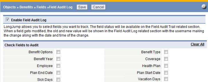
When the Field Audit Log option is enabled, any changes to the selected fields are logged in the Related Information section of the object.
When a field is modified, a new row containing the following information is added to the log:
- Original field value
- New field value
- User name
- Date and Time Modified
- Note: Date Created is not logged
Users that have the Customize Objects permission can set the Field Audit Log
Users that have the Manage Audit Log permission can view the Audit Log
Enable the Field Audit Log
- Click Designer > Objects > {object}
- Click the [Field Audit Log Settings] button
- Click Enable Field Audit Log
The list of object fields appears. - Click the checkbox next to the field(s) that should be audited; Choose up to 20 fields per object
- Click [Save]
Set Field Audit Log to be Visible in Related Information
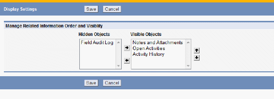
By default, the Field Audit Log is Hidden in the Form. To make it appear:
- Navigate to the object of interest in Forms
- Click the Display Settings link
- Move the Field Audit Log object to the Visible column and Save your changes
-
- To select multiple elements from a list that are not adjacent, press and hold the CTRL key and click each element individually (CTRL-click)
- To select a series of adjacent elements, click an element at the beginning of a series, press and hold the SHIFT key, then click the last element in the series (SHIFT-click)
Role-Based Field-Level Permission Control
For Developers
Visit these pages for a list predefined fields in
Guidelines for Add/Update Field Value
The Order of precedence of field properties (#1 takes precedence over #2, etc.):
- Add/Update Field Value
- For the API/UI calls, the Always Required property applies, even if the field is defined as hidden/read only via Form Layout or Field Visibility settings
- Fields defined as Hidden/Read-Only via Field Visibility settings can not be added/updated from the UI, and should not be added/updated from the API
- Fields defined as Hidden/Read-Only via Display Attributes are considered only for UI calls (but not API calls)
- Hidden Fields can be updated through the scripting
- Fields defined as part of Custom Objects can be set to Read-Only or Hidden via Field Visibility settings
- Log Access Violation
-
- When fields defined as Hidden/Read-Only via Field Visibility settings are used in an API/UI request, the entry can be logged in the Audit Log, provided that the Enhanced Security Audit is enabled


