Difference between revisions of "Using Icons in Data Entry Forms"
imported>Aeric m (Text replace - 'Page Icon' to 'Wrench Icon') |
imported>Aeric |
||
| Line 8: | Line 8: | ||
===Wrench Icon=== | ===Wrench Icon=== | ||
The Wrench icon [[File:WrenchIcon.jpg]] provides different options, depending on the current context. Think of it as "context-sensitive" tooling. | |||
===View Icon=== | ===View Icon=== | ||
Revision as of 22:54, 21 July 2011
Find these fields and icons in the platform:
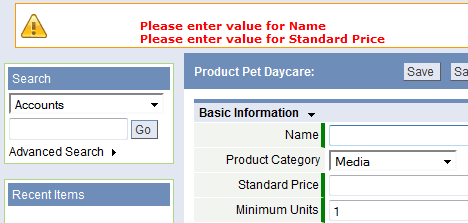
Required Field
Required fields are highlighted to indicate that data input is required. If a Required field is empty and an action is taken on the record (Edit and Save for example), an Error Message is displayed. To change the attributes of a field, see the Display Attributes section in Edit Field Properties.
| Required fields are highlighted with a green bar to the left side of the field. | ||
| Fields without a highlight are optional |
- Considerations
- Checkbox fields are not eligible as Required fields
Error Message
Error Messages are displayed when additional information is needed, or the data you entered does not meet the field format or criteria.
Wrench Icon
The Wrench icon File:WrenchIcon.jpg provides different options, depending on the current context. Think of it as "context-sensitive" tooling.
View Icon
Lookup Icon
A Lookup field can be identified in a form by the appearance of a Lookup icon ![]() . The Lookup icon is used in data entry to view and select items from a Lookup Window.
. The Lookup icon is used in data entry to view and select items from a Lookup Window.
Optionally, use the Auto-Completion for Lookup Fields option for faster data entry in Lookup fields.
Table of Icons
The following table explains how to use the navigation buttons and icons that appear in the platform.
| Icon | Name | Action |
|---|---|---|
| Lookup | Lookup related information from a list | |
| Quick Edit | Open a Quick Edit dialog box | |
| Calendar | Show a calendar (select a date) | |
| Copy Short URL | Open a dialog that contains a URL you can copy. You can then use that URL as a browser link to get back to the page it came from. | |
| Record Attempted | Update Activity status or details | |
| Folder icon | Display details for a record in a View | |
| Pencil icon | Edit a record in a View | |
| Checkmark | Mark an Activity as complete | |
| Log Activity | Update an Activity | |
| Remove Selected | Removes one or more selected items from a list | |
| Add button | Adds additional fields of the type included in that section or page | |
| Up arrow
Down arrow |
Moves the selected item up in the list
Moves the selected item down in the list See Arrow Button for more detail | |
| Right arrow
Left arrow |
Moves the selected item from the left column to the right column
Moves the selected item from the right column to the left column See Arrow Button for more detail | |
| Expand | Expand (show) a section to show additional fields | |
| Collapse | Collapse (hide) a section | |
| Edit widget | Edit a Widget | |
| Minimize widget | Minimize a Widget to show only the title bar | |
| Maximize widget | Maximize a Widget to full size | |
| Delete widget | Delete a Widget | |
| Edit Layout and Edit Field | Edit Forms and Fields in Objects | |
| Manage Related Information | Use the Manage Related Information icon to add, edit or delete buttons in a Related Information Section | |
| Move Field icon | Rearrange fields in a Form | |
| Delete icon | Delete a field from a Form, delete a Form, delete a Related Information Section | |
| Help button | Get help. (To read help pages side-by-side with the application, right-click on this icon and choose Open in a New Window.) |


