User:Aeric/Style Guide
1 "Oracle Free" Documentation Standards (aka "Oracle Clean")
While Java technologies are free and open source, J2EE technologies are not. Agreement could not be reached for a support contract, so it is important to ensure that all Software AG technologies (and all documentation about those technologies) remain free of license-encumbered terminology, to prevent potential multi-million dollar lawsuits.
The initiative aimed at getting such technologies and references out of Software AG products and support documents is known as the Oracle Clean Compliance intiatiative (OCC).
1.1 The OCC Rules
These are is a summary of the rules, plus a couple of notes on version numbers gleaned from the experts. (For more detail, see the Wording Guidelines.)
- We are not allowed to say that our products adhere to, comply with, implement, or are certified against the Oracle-owned Java specifications and APIs
- We are not allowed to use the names of J2EE technologies as brand names
- (e.g. "webMethods JMS Adapter" could be construed as a Software AG flavor of the Java EE specification)
- We are not allowed to call out J2EE specifications or refer to specific versions of specifications or APIs.
After checking:
- A version number in a URL counts as reference to a specific version
- If we point to a generic 3rd party page, and that page happens to mention a version number, it's not something we're responsible for (so we can do that)
- We are allowed to say that our products support, are based on, or use the particular Java standard or protocol
Also:
- "We need to ensure that each product will be scanned automatically and continuously by each team".
- (This style guide an entry is an attempt to achieve that goal for the documentation.)
Primary references:
Other references:
1.2 Impact on the AgileApps Live Docs
References to version numbers were removed from these terms in the AgileApps Live documentation. Going forward, it's important to be sure they don't slip back in:
- JSP
- JSTL
- J2EE
(These are the only terms that have appeared in the AgileApps Live documents, to date. The list of terms the company needs to be wary of is much larger. Here is the complete list.)
Notes:
- Reflection APIs and other advanced APIs are intentionally made unavailable to developers of Java classes in the platform, because they are dangerous.
- We do not provide a list of which libraries are available (or absent), because classes written for the platform tend to be relatively simple.
- For both of those reasons, we don't identify the Java version supported in Java classes, or link to Java APIs. (The information is available in the Software Requirements for an on-premise installation, but is not specifically called out in the programming pages.)
2 Pages Targeted by the Platform
Some redirects are pages that the platform links to. Those redirect pages should not be deleted. I started a list of those pages here: Category:Platform_Link.
- Note:
The Tenant Management System page is a redirect page targeted by the platform. The "Platform Link" category is on that page. That works out nicely, because the average user never sees it. Instead, only the categories specified on the final destination page are seen.
3 Diagrams, Images, and Screenshots
3.1 Logos
Logos need to be 160px wide X 135px tall. Using Adobe Illustrator to create one, I found that:
- Like all graphic programs, it sizes to the amount of stuff on the page, so you have to put a box in the background to get the size you want.
- Creating a box 160px wide produced 160x wide output
- But a box that was 135px tall produced output that was too tall!
- Double checking 20 or 30 times, there was nothing extending outside the box!
- Making the box 122px tall generated 135px output.
3.2 Uploading an Image
There does not seem to be any way to upload images en masse, short of finding the APIs and writing a program to do it. So each one must be added manually:
- In the sidebar, click toolbox > Upload File.

Tip: After uploading a new version of an image, delete the old version to minimize the wiki's footprint. (There doesn't seem to be a way to automatically purge file history-- although there are multiple scripts that seem like they should do it.)
3.3 Editing an Image
- Paint isn't bad for moving stuff around
- The SnagIt editor is pretty good, too.
- Adobe Illustrator is supposed to be great, but it's anti-intuitive and doesn't have that many features when it comes to adding graphics. It is, however, terrific for leaving the original screenshot intact while adding things as overlays.
- PowerPoint or the OpenOffice equivalent is the easiest way to add circles and arrows.
3.4 Matching Text in an Image
- Text
- Arial, Kalinga, Tahoma, Trebuchet fonts are close for numbers, but not exact
- Company Name in upper left
- Calibri, 24 pt
- Dark blue -- Hue 140, Sat 15, Lum 44. Red 44, Green 47, Blue 50 is as close as I've gotten
3.5 Creating an Image
3.5.1 Image Size
Scaling:
- Images from the Workspace don't seem to need resizing.
Text seems smaller, and is definitely closer together. - Images from the Designer view generally do need resizing.
Text seems larger, and is generally farther apart.)- Resize to 75% in Snagit (convenient, and close enough)
- Resize to 80% in Adobe Illustrator
(same effort, slightly closer to Wiki font size and slightly more readable.)
- Images from the Workspace don't seem to need resizing.
Width:
- Less than 700 pixels is ideal. (Most easily viewed on screen)
- Good size that works frequently is 750px
- Realistic maximum is 865 (still printable and readily viewable)
- Absolute maximum is 1000px (goes past the edge of the screen)
- Photoshop for Screenshots (old)
-
- In Photoshop capture and save screenshots as .psd format.
- Crop images to 750px wide, then Save For Web as .gif
- When necessary, use Image Size in Photoshop to reduce wide images, however this often results in poor readability. It is a better practice to frame the browser window so that all elements fit naturally in a 750px space. Sometimes it is necessary to "cheat", and manipulate image elements manually so that the resulting image is of good quality and readability - avoid this if possible.
- In the wiki, use Upload File to load a file to the \Images folder
3.5.2 SnagIt for Screenshots & Basic Graphics
Taking screenshots is easy in SnagIt, and the editing features are good. But the text in the image tends to be way larger than the Wiki text, unless you resize it. (You can do that in SnagIt, before saving.)
Notes:
- 12pt Arial font works well for callout-text after the image has been resized down 75%
3.5.3 Adobe Illustrator for Callouts
AI is good for adding objects to a background image, without modifying the image:
- Take a SnagIt image:
- Do not scale it
- Save as {name}-base.png
- Open AI.
- Choose relationals/techpubs/images/templates/callouts.ait
- Import graphic
- File > Place (link to link to the file, instead of copying it in)
- Right Click > Arrange > Send to Back
- Arrange callouts
- Resize:
- Select all
- Choose Scaling Tool (Double click. Under the Shearing Tool or Resize Tool, if not visible.)
- Resize to 80%? --Was necessary, once upon. Platform font seems smaller now.
- File > Save
- File > Export as {name}.png
- Resolution = 72 DPI (web)
- Take a SnagIt image:

Important: A resolution of 150 or 300 DPI doubles and quadruples the image size, for reasons unknown to me at this time.
- Using Adobe Illustrator
Remove a Linked Graphic Work with Other Shapes - Window > Links (Link Tool panel appears)
- Select Link
- Click "Go to Link" icon at bottom of Link Tool panel)
- The image is now selected. (Click it to be sure!)
- Press the Delete key
- Find: Click and hold over a tool
that has a small arrow
in lower right - Circle: Ellipse tool, hold shift key
while resizing.
3.5.4 SmartDraw for Diagrams
SmartDraw is easy to use, with lots of pre-built components in its libraries. The best way to create the diagram:
- Use 8-point font as the base font in the image (8-point Verdana for text)
- Use 10-point Arial (italicized is good) for major headings
- Save the image at 80% size.
Otherwise, the text is far too large when viewed in the wiki.
4 SyntaxHighlighting
This is the basic wiki syntax:
- :<syntaxhighlight lang="..." enclose="div">
- ...
- </syntaxhighlight>
- where language is one of java, html4strict, or xml.
- (java is the best choice for a JSP page)
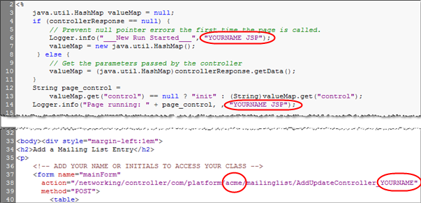
Take a screenshot of an editor to add circles and arrows.
For a JSP page, I had something really good once upon a time, but no longer recall what it was. That editor gave me this:

The Crimson Editor doesn't look too bad, though.
- Tools > Preferences > Fonts > Miscellaneous > Column mode, Size=11 for best line numbers (I think)

For a screenshot of Java code by itself, use NotePad++.
For Java code that accompanies a JSP page, use the Crimson Editor to match the styling.
5 Writing an Article
- Start with a concept, a description of the feature; art or some screenshot is good to show (top right)
- User permissions
- How-to (...accomplish a thing)
- Considerations (bulleted list of disclaimers)
6 Naming Articles
- Each wiki page is named to match the name of the feature; this is important because users search for what they see in the UI, and MediaWiki makes every page searchable
- Add a Category to each page; this makes the page available from the Category Tree
- When adding a new article, consider if it should be added to any of these Categories as well:
- Overview
- Core Concepts
- Glossary
- Learning Resources
- API pages may have a prefix, i.e., REST API:field Resource, because the term 'field' is too common and used elsewhere on the site
7 Wiki Conventions
- To make it easier to go from the GUI to the Wiki, the Wiki tries to have a page for each section heading in the GUI. In most cases, it should be possible to search on a section heading, to find the material you're looking for.
- From any given page, you can use "What links here" to get more information. (Links tell you where material is used, "transclusions" point to pages that provide a larger context.)
- When you follow a link to a Wiki page, it sometimes raises the question, "Where is this section in the GUI?" To help answer that question, pages that correspond to GUI sections have a GUI path at the top. Those paths tell you what actions you take to get to that section of the GUI. The general format of a path looks like this:
- Do this > Then this > And this
- This sample shows the kinds of the things you might see in a GUI path:
- Item > {choice} > [Button]
- This sample shows the kinds of the things you might see in a GUI path:
- where:
- Item - Typically an item in the navigation pane. Could also be a menu item.
- {choice} - A selection you make or a value you enter
- [Button] - A button you click
- where:

Note: Text you enter is often indicated in italics. But it may also be shown in monospaced font, if it pertains to a file, directory path, or code.
8 Setting up Labs
The goal is to write labs as time permits, whenever something is in progress, and then be able to move them around easily, so they don't have to be written in order, and so the forward-to-next-lab and back-to-last-lab links "just work".
(It's becoming clear that waiting for the decks to clear to start working on the labs is pretty much a non-starter, as propositions go, so we're going to have to build them as time permits and splice them together later.)
You Have [New] User Sees Lab 1 Lab 1 Labs 1, [9] Lab 1, 2 Labs 1, [6], 9 Lab 1, 2, 3 Labs 1, [4], 6, 9 Lab 1, 2, 3, 4
Method:
- A Lab Container page (Template:LabContainer)
- It's title is the Lab Number for the lab (e.g. Lab #3).
- It transcludes the actual Lab (e.g. Do Something)
- It has a pre-built footer with a link to last lab, link to lab index, and a conditional link to the next lab, if one exists.
- A Lab Number Function page (Template:LabNumber)
- It's title is Lab Number(Do Something), where "Do Something" is the title of a Lab
- It's content is simply "Lab N" (e.g. Lab 3, if "Do Something" is currently Lab #3.)
- It's goal is make it easy to reference a Lab, wherever it happens to move
- Usage: [[{{:Lab Number(Lab Title) | {{:Lab Number(Lab Title)}}: Lab Title]]
- (The link goes to the specified number, and displays Lab #3: Do Something
- The Lab Content page (Template:LabContent)
- Title: Do Something
- Includes a "Link to this lab".
Something for users to bookmark, since sequence can change. - Requirements: Can point to previous labs, referencing their lab numbers, using the Lab Number functions pages.
Future addition:
- Add LabTitle(N) function pages. For example: LabTitle(2), LabTitle(3), where the first returns "Do Something" and the next returns "Do Something Else". (It then becomes possible to make forward- and back-links more specific. E.g. "Lab #4" to "Lab #4: LabTitle(4)".)
9 GUI Pages
In the ideal world:
- Every tab in the GUI has a help icon
- Every help icon goes to a page that has "GUI breadcrumbs" at the top, and an H2 heading in the topic for each section heading in the GUI page, so the TOC lets users zero in on a particular section.
9.1 Breadcrumbs
"GUI breadcrumbs" at the top of the page record the shortest path through the GUI to the item in question. The give users a way to get to the material in the platform, after they have searched the Wiki or followed a link to find material of interest.
Sometimes, it's helpful to have two sets of breadcrumbs, one for users and one for designers. In that case, labels are added to identify the audience they're intended for:
View Data: Workspace > {object} > {record} > Related Information
Customize: Designer > Presentation > Forms > {form} > Related Information
More commonly, though, only one set of breadcrumbs is supplied. In that case, no label is necessary.
9.2 Sections
A GUI page typically has multiple sections. Each section should ideally be represented by an H2 head in the Wiki page, so there is a one-to-one correspondence between the section headings in the platform and the top-level headings in the Wiki page.
The last heading on the page should be "Learn more".
The GUI pages should be "minimal", and rely on links for relevant information:
- Concepts
- The element "Xyz" should link to an "About Xyz" topic so that someone familiar with the information isn't burdened by it, but someone new can find it.
- Tasks & Procedures
- The tasks and procedures that tell users how to do things should be in separate, "Working with" pages. The "Learn More" link(s) at the bottom of the page should link to the those.
- Reference
- Tables of detailed information that allow users to vary the tasks they can perform should also be on separate pages, with links from the GUI page.
10 "Working With" Pages
A "Working with" page should consist primarily of a series of tasks (procedures) that user might want to carry out. For example: Add an Xyz, or Rename an Xyz.
Conceptual information should be transcluded at beginning of the page, or the beginning of a section, as appropriate. For example: {{:About Xyz}}.
Reference information should be transcluded in the place where it is used, or in a section at the end of the page, if it is either very long or it is used in multiple places.
The directive should be included on that page, to make it easier to refer to the sections in conversation and during reviews.
-
Note: If appropriate, the "Working with" page may link to GUI pages. (In effect, GUI pages live in a separate namespace. Those pages shouldn't be transcluded, because they link to most of the same material--possibly in a more simplistic way that takes the user away from the current page.
11 Links to "Working with" Sections
Links from other pages should ideally go to sections in a "Working with" page, so that there is surrounding context for the user to explore. The problem is that the links are more difficult to formulate: [[Working with Xyz#Nailing the Xyz|Nailing the Xyz]].
One way around that difficult is to set up a page called "Nailing the Xyz" that has a redirect: #REDIRECT [[Working with Xyz#Nailing the Xyz]]. Links can then be more easily formulated as [[Nailing the Xyz]].
That strategy becomes more difficult if the "Nailing the Xyz" section needs to transclude the topic. The topic would naturally want to come under the heading "Nailing the Xyz", but that conflicts with the desired redirect page.
The solution is to prefix the topic with COMMON, so the topic page is called "COMMON:Nailing the Xyz". That solution kills two birds with one stone:
- It makes it possible to create a "Nailing the Xyx" topic that redirects to the "Working with" page.
- It says to anyone editing the page, "This topic is used in multiple locations. Make sure that your planned changes will work in each of them."
If the content isn't reused, then a different prefix is needed. ("About" for a concept, "Task:", or "Ref:", or as a last resort, "Content:".
12 The Category Hierarchy
-
Note: This applied to platform categories. Rethinking the proposition for ServiceDesk
Categories define a hierarchy, by virtue of defining "category pages" that belong to other categories. But since the categorytree extension is installed (and running in the sidebar) the user never has to view a category page. Instead, each category page looks like this:
#REDIRECT [[Some Page]]

[Category:Parent Category]]
When a user clicks on a category in the category tree, they get redirected to a content page. Meanwhile, the tree shows the other category pages that belong under the category.
-
Note: The target page for the redirect should always be some form of "Working with" page (whether or not it has that particular name) that encompasses the pages below it in the hierarchy--preferably by way of transclusion.
13 Category Hierarchy in the Sidebar
The options are specified in LocalSettings.php
High level categories that are listed independently in Template:Sidebar HD are removed from the category listing, to avoid redundancy. Those categories are collected in Category:Sidebar Categories
-
Note:
The "categories" heading for the sidebar box appears to be defined near the end of extensions/categorytree/CategoryTreePage.php. But after making a modification, nothing changes--even after restarting Apache, to force the modified PHP file to be read. (That item appears to be a selector key for localization--not the text that is displayed.)If there is a LocalSettings variable that could be modified, I have yet to figure out what it could be. Meanwhile, the change from the default "categories" doesn't appear to have affected anything! Mysterious.
Meanwhile, the next most likely location appears to be
  C:\www\hd91\languages\messages\MessagesEn.php:
  Line 2485: 'categories' => 'Categories'
(The right hand side would be the one to change. Even though it's capitalized, capitals are converted to lowercase in the sidebar. Unfortunately, that label could be used elsewhere, so it's not worth changing without time to experiment. -eric)
14 Hacking the Category Tree
The Category Tree is one of the many extensions used in the support wiki. By default, the Category Tree organizes pages in each category alphabetically. See an example of a Category page at: Category:Platform Administration. Note that all the subpages are listed at the bottom of the Category page.
It was important to the design that the Category Tree be able to map UI elements in a specific order, especially Setup. The way to cheat this is by using the MediaWiki "pipe trick".
In the following example, we have three articles that belong in the Setup category:
- Personal Setup
- Customize
- Administration
If the usual Category syntax were added to each page, these articles would be listed in alphabetical order in the Category Tree, which is not desired:
- Customize
- Monitor
- Personal Setup
Using the pipe trick, add following category tags to the pages as indicated:
Article Category tag (added at the bottom of the article) Personal Setup [[Category:Setup| 1]] Customize [[Category:Setup| 2]] Monitor [[Category:Setup| 2.4]]
- Notes
-
- A space after the pipe "|" is required
- The numbers can be any decimal number between 0 - 9.9
- Only a single number after the decimal is allowed
- Use decimals when there are more than 10 items in a category, for example the Category:Platform Administration page
15 Special Pages
- Mediawiki:Breadcrumbs - Used by an extension that was originally installed for Wiki breadcrumbs, but not kept up to date. (GUI breadcrumbs are more desirable, for GUI pages.)
- Mediawiki:Common.css - Add CSS styles to the wiki on this page. Styles defined here override whichever "skin" happens to be in use. (Put stuff here to experiment. When satisfied, move it to the .css file in the skin.)
- Template:Sidebar - The wrapper that selects the nav pane to display. (Transcluded into MediaWiki:Sidebar.)
- Template:Sidebar Basic - Basic Nav Pane, with info for end users, application designers, system developers and sys admins.
- Template:Sidebar PlusPlatformAdmin - Nav pane that adds tenant configuration info for LJ
- Template:Sidebar PlusInstall - Nav pane that adds tenant configuration and installation info, at isv.platformatyourservice.com
16 Useful Directives
- #REDIRECT [[new page]] - redirect current page elsewhere
- __TOC__ - put a Table of Contents here
- __NOTOC__ - No TOC on this page
- {{DISPLAYTITLE:page Title}} - Change the capitalization of the page title (must match in all other respects)
- - Numbers the headings in the page to match the numbering in the TOC. Useful for the large mega-documents with lots of transclusions, especially when printing things out for review, so you can find things (printouts don't seem to get page numbers, for some reason).
- ... - ...