Difference between revisions of "Accessibility Mode"
From AgileApps Support Wiki
imported>Aeric |
imported>Aeric |
||
| Line 1: | Line 1: | ||
Accessibility mode works only on AgileApps new UI. Select '''Swtich to new UI''' icon before using accessibility mode. | Accessibility mode works only on AgileApps new UI. Select '''Swtich to new UI''' icon before using accessibility mode. | ||
[[File:14161 3.png|700px]] | |||
To enable accessibility mode in AgileApps:<br> | To enable accessibility mode in AgileApps:<br> | ||
Revision as of 11:07, 25 February 2021
Accessibility mode works only on AgileApps new UI. Select Swtich to new UI icon before using accessibility mode.
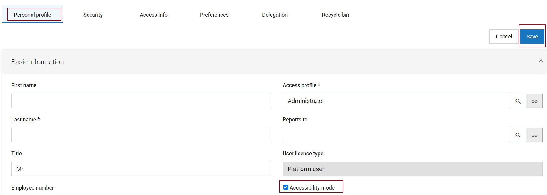
To enable accessibility mode in AgileApps:
{Login Name} > Edit profile > Personal profile Tab > Accessibility Mode checkbox > Save
Note:
Detailed information on all the accessibility features achieved using keyboard shortcuts is available here: Keyboard Interaction for AgileApps new UI Accessibility.
Keyboard Accessibility
The AgileApps Platform is designed to be as accessible as possible through a keyboard. Users can easily tab through the platform UI.
- Use the Tab and Shift+Tab keys to move forward and back through the links and other selectable fields.
- Use Arrow keys to work within menus or radio button groups to navigate between entries.
- Use the Spacebar or Enter keys to select or de-select the current checkbox or radio button, to open a file, or to select the link in focus
- Use the Esc key to close a popup window.
Tab-through provides the following options:
- When focused on tabs, use right/left arrow keys to switch tabs.
- Use skip links to shift focus to different parts of the page without tabbing through every element.
- On edit pages such as forms, the keyboard focus starts at the first editable field on the page.
- In the application navigator when accessibility is enabled, tabbing moves you through each element for every module. Use the arrow keys to move through the application navigator without focusing on these additional elements.
Color and highlight accessibility
- The GUI component that has current focus is shown with stronger highlighting.
- Fields on a form include a tooltip icon. Icon name is highlighted when the icon is in focus.

