Difference between revisions of "Record View"
From LongJump Support Wiki
imported>Aeric |
imported>Aeric |
||
| (15 intermediate revisions by the same user not shown) | |||
| Line 1: | Line 1: | ||
'''Workspace > {object} > {record}''' | |||
The Record View (also known as the Record ''Detail'' View) shows you information for a single record. | The Record View (also known as the Record ''Detail'' View) shows you information for a single record. | ||
===About the Record View=== | |||
You open the Record View from an object [[View]]--typically, from a [[List View]], as shown here, by clicking the Folder icon [[File:FolderIcon.png]]: | You open the Record View from an object [[View]]--typically, from a [[List View]], as shown here, by clicking the Folder icon [[File:FolderIcon.png]]: | ||
| Line 9: | Line 11: | ||
:{| | :{| | ||
| | | | ||
# [[# | # [[#Page_Control|Page Control]] | ||
# [[# | # [[#Action_Buttons|Action Buttons]] | ||
# [[# | # [[#Links_and_Icons|Links and Icons]] | ||
| valign="top"| | | valign="top"| | ||
<ol start="4"> | <ol start="4"> | ||
<li>[[# | <li>[[#Record_Name|Record Name]]</li> | ||
<li>[[#Social Networking (Relay) Operations| | <li>[[#Social_Networking|Social Networking (Relay) Operations]] and [[#Tags|Tags]]</li> | ||
<li>[[# | <li>[[#Information_Sections|Information Sections]]</li> | ||
</ol> | </ol> | ||
|} | |} | ||
:[[File:RecordView.png]] | ::[[File:RecordView.png]] | ||
:;<span id="Page_Control">1.Page Control</span>: | |||
::If more than one page is required to display information, this control shows you where you are, and lets you move from page to page. | |||
:;<span id="Action_Buttons">2. Action Buttons</span>: | |||
:::You can define your own [[Action]] buttons, but these four are the default: | |||
::* '''[Edit] -''' Click this button to modify the record. | |||
::* '''[Clone] -''' To save yourself some work, make a copy of an existing record and then modify the fields that are different. | |||
::* '''[Print] -''' Create a PDF or HTML page from the record, formatting it using one of the standard or custom-build [[Forms]] or [[Print Templates]]. Then email page content, save it as a web page, or print it out. (More below) | |||
::* '''[Delete] -''' Delete the record. (If you find you need it later, check the [[Recycle Bin]].) | |||
:;<span id="Links_and_Icons">3. Links and Icons</span>: | |||
::These standard links and icons make your life easier: | |||
::* '''Customize this Form -''' A record is displayed using a [[Form]]. The default form is displayed, if no other form is chosen, or if the user's [[Role]] doesn't dictate the Form they see. When you have the appropriate privileges to modify Forms, this link is displayed. Click it to change which fields are displayed, the order in which they occur, and many other aspects of the Form. | |||
::* '''Pin icon [[File:PinIcon.png]] -''' When a page opens up as a new window nested in the current tab, this icon appears. Click it to create a new tab, "pinning" this page to the tab bar. | |||
::* '''Delete icon [[File:DeleteIcon.png]] -''' Click this icon to delete the record. | |||
::* '''Refresh icon [[File:RefreshIcon.png]] -''' Click this icon to update the page. | |||
:* '''[ | |||
:* '''[ | ::* '''Help icon [[File:HelpIcon.png]] -''' Click this icon to go to a support page designed specifically for the tasks you're doing. | ||
: | :;<span id="Record_Name">4. Record Name</span>: | ||
::The record "name" typically comes from the first field defined for the record. (It can be changed using [[Record Locators]].) In this case, the Customer Name does a good job of identifying the record. | |||
: | :;<span id="Social_Networking">5. Social Networking (Relay) Operations</span> and Tags: | ||
::Use these buttons to interact with [[Relay]]: | |||
: | :::;Show Relay: Display the Relay feed corresponding to this record, showing recent posts that were made about it. Add your own comments, if you like. (Changes to "Hide Relay" when the feed is displayed.) | ||
: | :::;Follow: Follow this record. That way, every new post made to this feed comes to your feed "aggregator", where you get posts from every record, group, and user you are following. | ||
: | ::<span id="Tags">'''Tags'''</span> | ||
::This area of the tool bar displays Public (visible to all) and Private (visible to you only) tags that have been applied to the record. Click the Pencil Icon [[File:PencilIcon.png]] to add new tags. | |||
: | ::Tags are free-form. You can type anything you want. But it helps to keep things consistent. The Tag dialog shows you tags that have been most recently used and tags that are most popular. | ||
: | ::Then, on your Home Page, create a Tag Cloud [[Widget]] to rapidly access records by their tags. | ||
= | :;<span id="Information_Sections">6. Collapsible Sections</span>: | ||
::Sections can be collapsed by clicking the icon at the end of the heading. | |||
:;Basic Information: | |||
::The information shown is configurable, but the kind of information displayed in the screenshot above is fairly typical. The current record owner is shown, along with significant fields in the record. | |||
:;Record Information: | |||
::These are standard tracking fields defined by the platform, showing when the record was created, when it was last modified, and by whom. | |||
; | :;Related Information: | ||
::The Related Information section displays information from records that are ''related'' to this one. | |||
::For example, Notes and Attachments records are displayed here. (You can also click a button to add a Note or an Attachment on the spot.) For a Customer object like this, the customer's Orders might well be displayed, if the application designer chooses to do so. | |||
===Working with the Record View=== | |||
=== | ====Printing a Record==== | ||
{{:Print a Record}} | |||
====Editing a Grid Section==== | |||
In general, editing a record is a matter of filling in fields and clicking [[Lookup]] icons to select records. But records may also display ''related records'' (a collection of records that are related to the one you are viewing). | |||
For example, an Orders record might contain a ''grid section'' that displays OrderItems, like the one shown here: | |||
:[[File:GridInForm.png]] | |||
: | |||
: | In a Grid Section, you: | ||
:* Fill in fields to create or edit related records. | |||
:* Click '''[Add More Lines]''' to make the grid section larger. | |||
:* Click the Trashcan checkbox at the end of a line to delete the row.<br>(The row is deleted when you '''[Save]''' the record the grid section is in.) | |||
Latest revision as of 23:10, 7 September 2011
Workspace > {object} > {record}
The Record View (also known as the Record Detail View) shows you information for a single record.
About the Record View
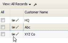
You open the Record View from an object View--typically, from a List View, as shown here, by clicking the Folder icon ![]() :
:
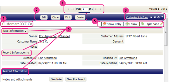
The parts of the record View are shown here, with links to detailed information below:
- 1.Page Control
- If more than one page is required to display information, this control shows you where you are, and lets you move from page to page.
- 2. Action Buttons
-
- You can define your own Action buttons, but these four are the default:
- [Edit] - Click this button to modify the record.
- [Clone] - To save yourself some work, make a copy of an existing record and then modify the fields that are different.
- [Print] - Create a PDF or HTML page from the record, formatting it using one of the standard or custom-build Forms or Print Templates. Then email page content, save it as a web page, or print it out. (More below)
- [Delete] - Delete the record. (If you find you need it later, check the Recycle Bin.)
- 3. Links and Icons
- These standard links and icons make your life easier:
- Customize this Form - A record is displayed using a Form. The default form is displayed, if no other form is chosen, or if the user's Role doesn't dictate the Form they see. When you have the appropriate privileges to modify Forms, this link is displayed. Click it to change which fields are displayed, the order in which they occur, and many other aspects of the Form.
- 4. Record Name
- The record "name" typically comes from the first field defined for the record. (It can be changed using Record Locators.) In this case, the Customer Name does a good job of identifying the record.
- 5. Social Networking (Relay) Operations and Tags
- Use these buttons to interact with Relay:
- Show Relay
- Display the Relay feed corresponding to this record, showing recent posts that were made about it. Add your own comments, if you like. (Changes to "Hide Relay" when the feed is displayed.)
- Follow
- Follow this record. That way, every new post made to this feed comes to your feed "aggregator", where you get posts from every record, group, and user you are following.
- Tags are free-form. You can type anything you want. But it helps to keep things consistent. The Tag dialog shows you tags that have been most recently used and tags that are most popular.
- Then, on your Home Page, create a Tag Cloud Widget to rapidly access records by their tags.
- 6. Collapsible Sections
- Sections can be collapsed by clicking the icon at the end of the heading.
- Basic Information
- The information shown is configurable, but the kind of information displayed in the screenshot above is fairly typical. The current record owner is shown, along with significant fields in the record.
- Record Information
- These are standard tracking fields defined by the platform, showing when the record was created, when it was last modified, and by whom.
- Related Information
- The Related Information section displays information from records that are related to this one.
- For example, Notes and Attachments records are displayed here. (You can also click a button to add a Note or an Attachment on the spot.) For a Customer object like this, the customer's Orders might well be displayed, if the application designer chooses to do so.
Working with the Record View
Printing a Record
- To print a Record
- Visit the Object Record.
- Click the [Print] button
A dialog box opens with printing options. - Choose your printing options:
- Choose to format the record using a Print Form or a Print Template.
(If you choose Print Template, and none exists, a button appears to let you create one on the spot.) - Choose Portrait or Landscape orientation for the printer
- Choose to Open in a New Window or Save as Document
The generated format depends on your choice and the type of template:
- Choose to format the record using a Print Form or a Print Template.
Save as Document Open in a New Window JSP template PDF HTML HTML template Word template Word document PowerPoint template PowerPoint file
Editing a Grid Section
In general, editing a record is a matter of filling in fields and clicking Lookup icons to select records. But records may also display related records (a collection of records that are related to the one you are viewing).
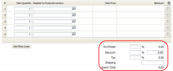
For example, an Orders record might contain a grid section that displays OrderItems, like the one shown here:
In a Grid Section, you:
- Fill in fields to create or edit related records.
- Click [Add More Lines] to make the grid section larger.
- Click the Trashcan checkbox at the end of a line to delete the row.
(The row is deleted when you [Save] the record the grid section is in.)


