Display Styles
From AgileApps Support Wiki
Revision as of 18:28, 25 February 2011 by imported>Alice (→Considerations)
Display Styles visually enhance the user experience, providing the ability to configure Form Layouts into optional sections and related information - users can then focus on data entry or access to information. Customize Display Styles to match the action (when Viewing, Adding or Editing a record) or define how to view Related information.
Available Display Styles
The following examples describe how these Display Styles can be used.
Considerations
- Display Styles are available in any Custom Object
- Only Sectional or Horizontal Tabbed Display Styles are available for CRM Objects
- At this time, only Sectional Display Styles are available in the Related Information section of the Projects object
- By default, all Form Layouts use the Sectional Display Style
- Display Styles can be assigned based on actions
- Display Styles are created via Form Layouts
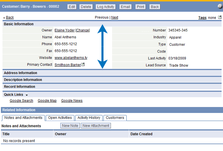
Sectional
|
Accordion Layout
|
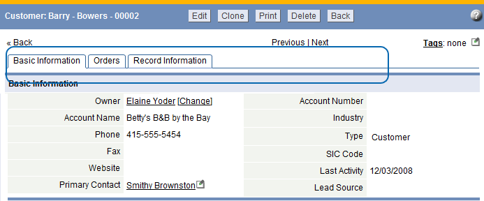
Horizontal Tabbed
|
Wizard
|
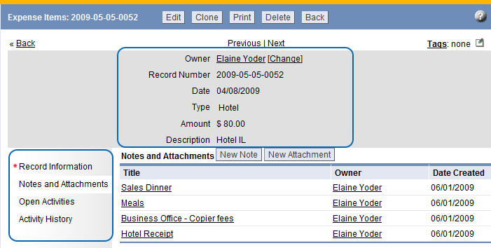
Vertical Tabbed
Note: In Views, Related Information is displayed as vertical tabs, Quick Links are not displayed |
Available Display Styles/Action Combinations
| When... | Choose one of these formats... |
|---|---|
| Viewing a Record |
|
| Adding a Record | |
| Editing a Record | |
| Viewing Related Information in a Record |


