Difference between revisions of "Display Styles"
From AgileApps Support Wiki
imported>Alice |
imported>Aeric |
||
| (6 intermediate revisions by the same user not shown) | |||
| Line 1: | Line 1: | ||
Display Styles visually enhance the user experience, providing the ability to configure [[ | Display Styles visually enhance the user experience, providing the ability to configure [[Forms]] into optional sections and related information - users can then focus on data entry or access to information. Customize Display Styles to match the action (when Viewing, Adding or Editing a record) or define how to view Related information. | ||
==Available Display Styles == | ==Available Display Styles == | ||
| Line 7: | Line 7: | ||
*Display Styles are available in any {{Type|}} | *Display Styles are available in any {{Type|}} | ||
*Only [[#Sectional|Sectional]] or [[#Horizontal Tabbed|Horizontal Tabbed]] Display Styles are available for CRM Objects | *Only [[#Sectional|Sectional]] or [[#Horizontal Tabbed|Horizontal Tabbed]] Display Styles are available for CRM Objects | ||
*By default, all [[Forms]] use the [[#Sectional|Sectional]] Display Style | |||
*By default, all [[ | |||
*Display Styles can be assigned based on actions | *Display Styles can be assigned based on actions | ||
*Display Styles are created via [[ | *Display Styles are created via [[Forms]] | ||
===Sectional=== | ===Sectional=== | ||
| Line 20: | Line 19: | ||
*This is the default display style | *This is the default display style | ||
|} | |} | ||
===Horizontal Tabbed=== | ===Horizontal Tabbed=== | ||
| Line 65: | Line 28: | ||
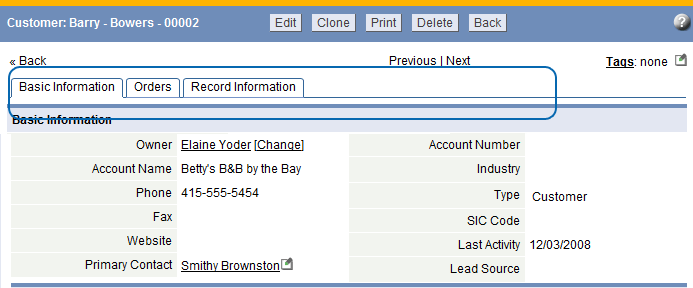
*Navigate to sections by clicking on a tab | *Navigate to sections by clicking on a tab | ||
|} | |} | ||
{{#ifeq: {{SKIN}} | HD | | |||
| <!-- LJ Apps --> | |||
===Wizard=== | ===Wizard=== | ||
{| border="0" cellpadding="5" cellspacing="0" | {| border="0" cellpadding="5" cellspacing="0" | ||
| Line 74: | Line 38: | ||
*Displays a single section at a time | *Displays a single section at a time | ||
*Navigate to sections by clicking the [Previous] or [Next] buttons | *Navigate to sections by clicking the [Previous] or [Next] buttons | ||
*Available when adding or editing a record (not when viewing) | |||
|} | |} | ||
'''Note:''' In Views, Related Information is displayed as vertical tabs, Quick Links are not displayed | '''Note:''' In Views, Related Information is displayed as vertical tabs, Quick Links are not displayed | ||
|} | |} | ||
}} | |||
Latest revision as of 19:09, 29 March 2013
Display Styles visually enhance the user experience, providing the ability to configure Forms into optional sections and related information - users can then focus on data entry or access to information. Customize Display Styles to match the action (when Viewing, Adding or Editing a record) or define how to view Related information.
Available Display Styles
The following examples describe how these Display Styles can be used.
Considerations
- Display Styles are available in any Custom Object
- Only Sectional or Horizontal Tabbed Display Styles are available for CRM Objects
- By default, all Forms use the Sectional Display Style
- Display Styles can be assigned based on actions
- Display Styles are created via Forms
Sectional
|
Horizontal Tabbed
|

